David Dean
Children's Illustrator
Who or what made you want to become an illustrator?
Like most illustrators, I think from a very early age I loved to draw. Although I did fairly well academically at school, I didn't really like school and so drawing was a different world - contained in my head and on a piece of paper - that I could escape into. And of course, I loved comics as a kid, so for a while I wanted to be a comic book illustrator. And then when I was maybe 15 I was looking at a Star Trek novel I was reading (another fantasy world to escape into!) and it dawned on me that someone actually painted the cover, and presumbaly was being paid for it. That's when I really started paying attention to book jackets in particular, and illustration in general, and knew that's what I wanted to do as a career. That led to me doing a BA(Hons) in Illustration with Animation and an MA in Communication Design, both at Manchester Metropolitan University.
Share your favourite piece of artwork from your portfolio and walk us through its creation.
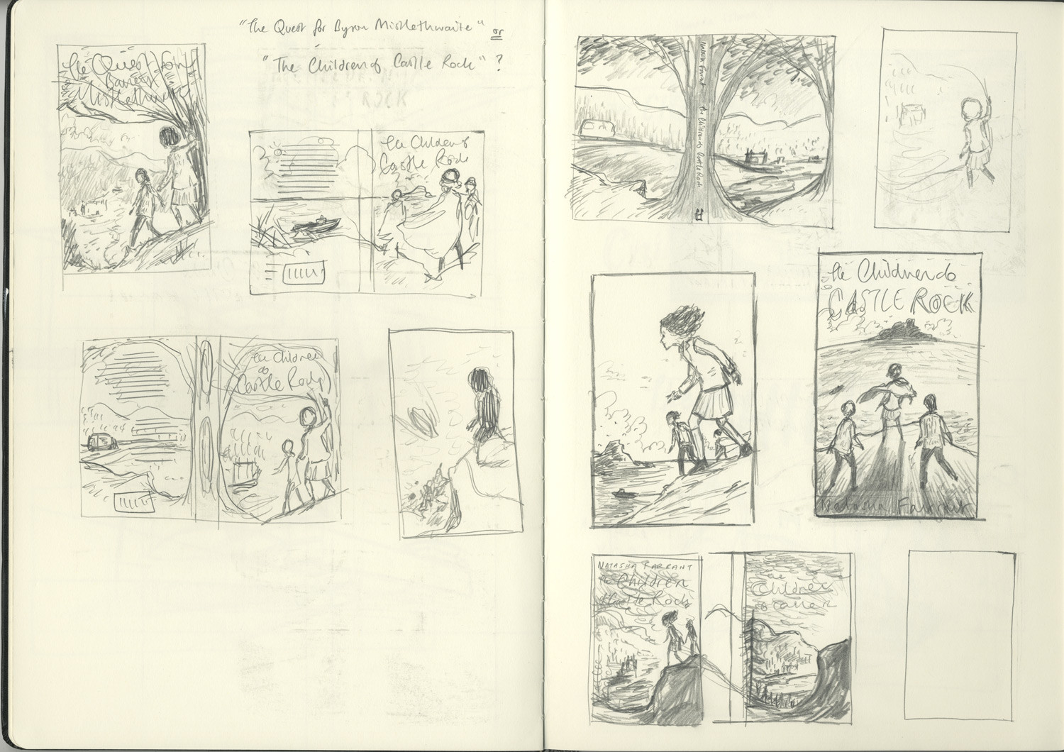
My favourite piece changes quite regularly but for the last year or so it has been the cover I did for Natasha Farrant's "The Children of Castle Rock", published by Faber & Faber. When I was commissioned to illustrate this one I don't think the manuscript was even finished so I was working from some descriptions of the main charcaters, a few pivotal scenes and the idea that the book's tone was "Enid Blyton meets St. Trinian's" (in fact, when I first received the brief, the book had a different title!). Normally I like to read the book before I start on the cover, but something about this one just spoke to me, and I ended up illustrating the book I had imagined in my mind from those bare bones. I was also asked to provide two alternative roughs/sketches. I began by doing a little research online of the highlands setting and then went straight into sketching out ideas in my sketchbook. Sometimes I'll go through many ideas before something starts to feel right, and occasionally the right idea arrives almost fully formed quite early on. This was one of those instances, and it just needed refining. As you can see, I soon got to a pencil sketch that isn't far away from the final cover. I then scanned this and carried on working on it in Photoshop. Depending on the length of the deadline for a project I like to work up my roughs in colour - not only does this save time (and possible false starts!) when it comes to painting the final artwork, but it gives me the freedom to experiment and try different things (the pink in the sky is a good example - I accidently adjusted the hue of the wrong layer, but it looked perfect). When I had the two alternative cover roughs done I submitted them to the designer at Faber, and was very quickly given the green light on my favourite of the two (the purple and yellow one) with no alterations needed.


Which project are you most proud of?
There are two recent ones that I'm proud of, though for different reasons.
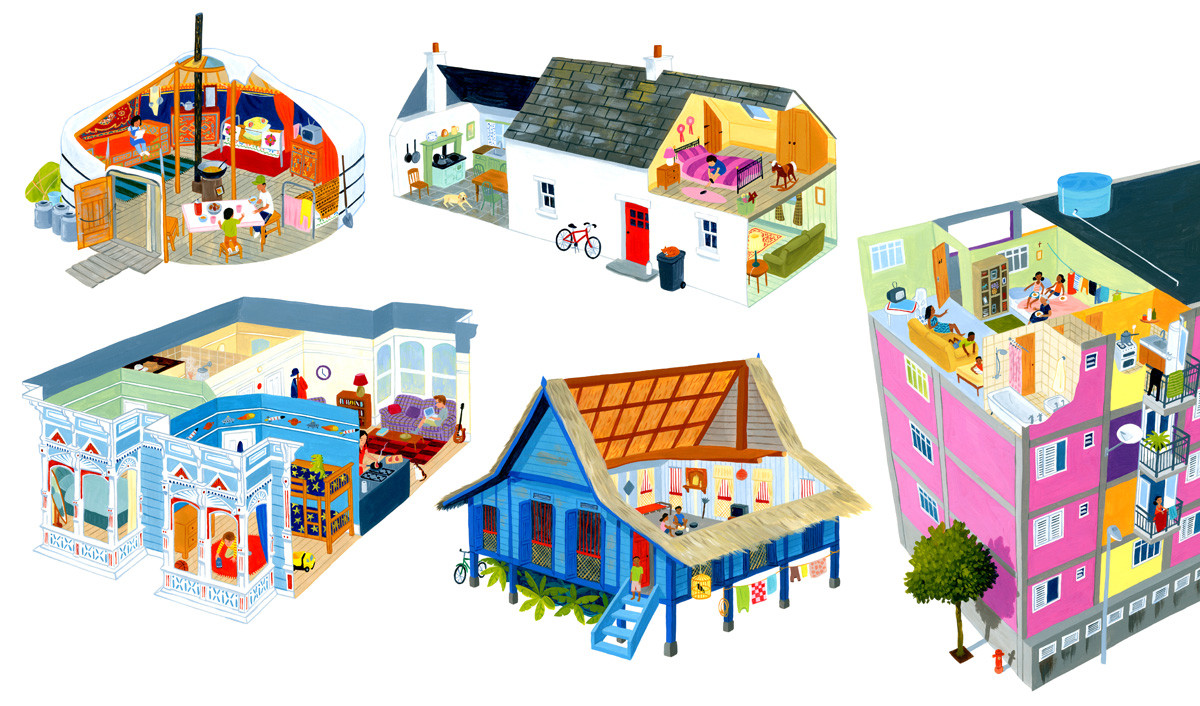
The first is The Barefoot Book of Children (re-titled as Children of the World for the paperback release) which I just think is a very important and very timely book. I live in Britain which is currently being split down the middle by Brexit, and it's easy to see watching the news how the US is equally divided on many issues, and sadly (in both countries) one of those issues is race, so it seems that a book that seeks to show children that for all our differences (the foods we eat, the homes we live in, the worlds outside our windows) there are far more fundamental things that unite us and that the differences just make the world a richer and more vibrant place.
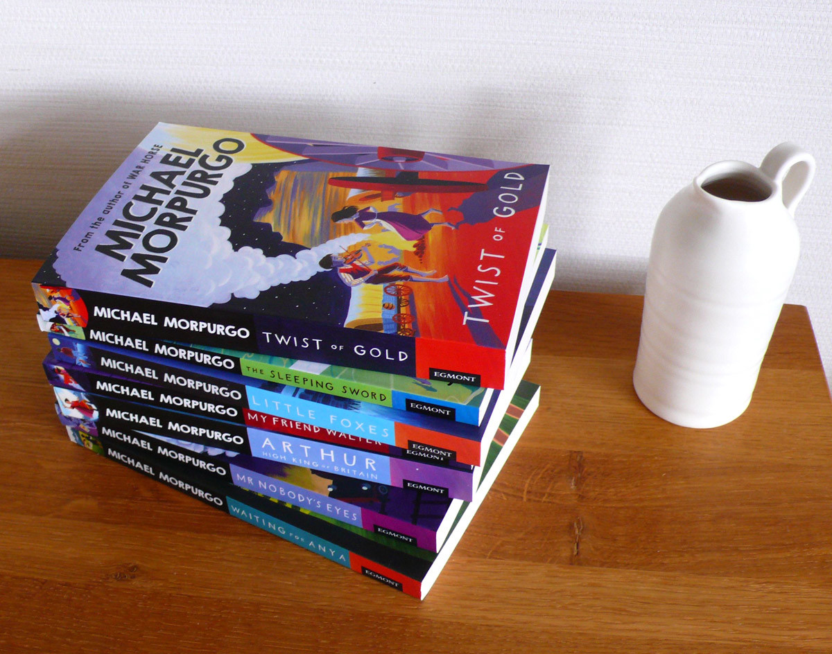
The second is the series of twenty covers I did for Egmont Books' reissue of their Michael Morpurgo backlist. To be asked to take on such a big project for such a major author (one of the covers was for 'War Horse' which is one of the best-loved children's novels of the last thirty or forty years) felt like a real validation of my work. And then to see some of the covers blown up to eight feet high and displayed in the V&A Museum of Childhood in London, with my artwork on the museum's windows, was a real thrill. Meeting Michael Morpurgo himself and hearing him praise my work was just the icing on the cake.


What was your first commission as a professional illustrator?
Haha! It was a book cover for a collection of essays - I was still a student on my MA course at the time and one of the lecturer's (a brilliant typographer) was also the art director for a small independent poetry publisher in Manchester. He asked me to do this cover for him and I think paid me the princely sum of fifty quid. It wasn't long after that when meeting agents that one (who went on to be my agent for the next 19 years) asked me if I had any published work. When I told her how much I'd been paid she said "you can keep that client"! After graduating my first commission was a horoscope illustration for Elle magazine (and that paid £250).
Have you ever thought about trying out a different technique or a different style?
I've thought about working digitally, mainly because everyone seems to these days. Most of my roughs are completed digitally, even if they start out in my sketchbook, and I do enjoy the freedom that Photoshop gives me to play around and experiment, particularly in terms of colour - I think it has made my use of colour much more sophisticated - but I love working in paint, and I think there is a timeless quality to work that has been created by hand on paper or canvas. I enjoy that physical connection to the finished piece.
As for style: well my style has developed over the years, as I've learned new things, as I've absorbed new influences, and sometimes as a result of being challenged by a particular brief, but I feel like it has been a gradual, organic development; there has never been that piece that I can point to as being totally different than anything that came before. And I think that is because I haven't really thought about my "style" in maybe 15 years or more. It isn't a hat I put on and can swap for a different one, though I hugely admire illustrators who do work in multiple styles, or take that risk and completely reinvent their portfolio. When I was at university and in my first few years of working professionally I used to do a lot of flat perspective that was inspired by Indian miniature painting, but it was always done very consciously. Now I feel like my style is just my natural voice, the way I see the world.
Which area of children’s publishing excites you the most?
I am passionate about book covers, and I've naturally gravitated towards novels for the 8-12yrs Middle Grade age range, where there's still an innocence and charm to the books; and whilst the subjects can be challenging (the death of a loved one, the horrors of war...) they're never handled in a way that is too dark, so I can use lots of lovely bright colours. There's usually a bit of adventure or mystery in those books too which lends itself to dramatic compositions and crazy persepctive, things that I just love doing.

Do you have a favourite soundtrack you listen to when you’re working?
When I'm researching or working on roughs I can't listen to music at all, but I do listen to podcasts. When I'm painting though, I have to have music, but I don't have a particular soundtrack. I do tend to get obsessed with a few albums that I listen to over and over for a couple of weeks before moving on to something else. At the moment it's Megson's "con-tra-dic-shun" (they're a fantastic folk duo from north east England), and the Wombats' "Beautiful People Will Ruin Your Life" which is nicely up tempo and has some charmingly wacky lyrics ("I brought a lemon to a knife fight"...).
Animals feature heavily in children’s books – do you have a pet?
I do - I have two cats, called Button and Ptolemy. They're brothers (littermates?) and are 11 now though they act like kittens half of the time. They frequently visit me in my studio whilst I'm working and they brighten up every day. They've also cropped up in quite a few of my illustrations!

What do you hope children take away from your drawings?
I hope they can get lost in them the way I used to do as a child, that maybe they can be that place to escape to that drawing (or Star Trek!) offered me. As a child I used to love the Brambly Hedge books - I don't really remember anything about the stories but those detailed illustrations of animals' houses have really stuck with me. I had the opportunity to paint a couple of spreads like that for The Barefoot Book of Children, and they were such fun to do.

