






Children's Illustrators
Featured News
Publisher Interviews
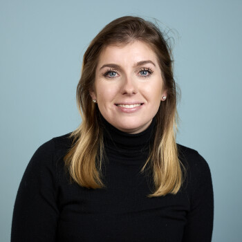
Like most people in our wonderful industry, I've always been a bookworm. My route in started when the opportunity arose to work Saturdays doing editorial for the Gardening list at DK, which I grabbed with both hands. After about six months, I left my PA role to join the team full-time. From there, I moved to the Jackets team, writing copy for children's and adult titles and ensuring cover art hit key sales deadlines, before transitioning permanently into Children's publishing, where I've been ever since.
I was given the Ted Smart DK Animal Encyclopedia for my birthday when I was little and became completely obsessed with it. That exact book is still in print and sits on the list I look after today, which is a real full circle moment. I'm unbelievably lucky to publish across such a wide spectrum; from baby board books and illustrated non-fiction to gift titles, middle-grade, and YA fiction on our DK flip list. I was lucky enough to always be taken to the library and be gifted books, and I was constantly reading or listening to audio tapes. While I don't think any single book defined my path, that childhood exposure is why we strive at DK to offer immense variety. You never know which book will be the one for a young reader.
It evolved very naturally. We had already begun branching into gift titles, preschool, and picture books with a non-fiction heart, exploring new formats and identifying market gaps beyond purely photographic layouts.
While at the Bologna Children's Book Fair, I met with Jenny at Nurnberg, Cornelia Funke's agent. She mentioned a brilliant new manuscript Cornelia had submitted, and I tried my luck by asking to read it. Once I read it, the hard work began because we needed to show Jenny and Cornelia how a middle-grade fiction title could thrive on a DK list; a list that historically focused only on non-fiction. They put their trust in us, and we published The Green Kingdom in March 2025. After securing UK and Commonwealth rights, we acquired US rights as well, and it became an instant New York Times bestseller. Arabella Stein joined us in January 2024, and together we rolled up our sleeves to build the DK flip imprint from the ground up.
Wildly different! In a single hour, I might be evaluating the fluffiness of a bunny's tail on a board book, refining the mechanical pop-up of a novelty title, discussing jacket design for a YA trilogy, and jumping into an auction for an outstanding debut non-fiction pitch. Balancing such a broad range of formats, creators, and genres is fast-paced, but that dynamic energy is where the best ideas are born. We have an extraordinary team of editors and designers who flex seamlessly across different book styles so I am very lucky to be part of that team.
It was equal parts daunting and thrilling! Moving at full speed, you rarely get a moment to catch your breath. It wasn't until Bologna, when we celebrated DK flip's first anniversary, that I paused to reflect on what the entire team had accomplished. That was a deeply rewarding moment.
We simply look for exceptional storytelling. Beyond reviewing submissions, Arabella and I spend a lot of time discussing the exact stories we wish existed and reaching out directly to creators we admire, Elodie Harper being a fantastic example. The core identity of DK flip is publishing the best book you haven't read yet. Every author, illustrator, and title earns its spot by bringing something distinct and memorable to a child's bookshelf.
The transition was wonderfully natural. Coming from a non-fiction background, our design and editorial teams are hyper-focused on visual appeal, print finishes, and paper quality. Rather than imposing a single DK flip look, our approach is entirely author and illustrator led, ensuring the visual execution feels tailored to each unique narrative.
Tractors in Space actually landed on my desk as a non-fiction proposal from Ross. But the sheer playfulness of the premise made it clear it needed to be an energetic, story-led picture book. What made the pairing work was the balance of Ross's snappy, humorous rhythm with Alex's vivid, character-driven artwork. In picture book pairings, we look for art that doesn't just mirror the text, but actively adds a second layer of storytelling and comedy.
With subject specialists, the starting point is often deep authority; taking complex expertise and translating it into accessible, fascinating hooks for kids. With household names, the magic lies in authentic motivation: why is this specific person passionate about sharing this message with children? Whether it's Rose Ayling-Ellis championing inclusivity or Dr Fern Riddell reframing history, the narrative must stem from genuine heart.
Fern has a brilliant ability to blow the dust off history and present it as vivid, human drama. We wanted to challenge the traditional, polished narrative of royal history and show young readers the rebellious, chaotic, and unconventional figures who actually shaped the past. It felt essential to publish because it encourages kids to critically question history rather than just memorise facts.
Preschool is where a child's relationship with books begins. Commissioning for this age group is a tactile, sensory experience - you are thinking about physical formats, lift-the-flaps, textures, and read-aloud rhythms. Unlike older fiction, where the story unfolds in the reader's imagination, preschool books rely entirely on immediate visual interaction and shared bonding between parent and child.
I look for artwork that tells a story entirely on its own - where a character's posture or a background detail reveals something extra. A distinct, memorable visual voice always stands out over generic trends and often we'll save illustrators we just LOVE but don't quite have the right home or manuscript or subject for yet.
It works both ways! Sometimes a manuscript immediately calls for a precise visual style, like high-energy graphic lines or soft, painterly textures. Other times, like I said above, we keep portfolios on file for months waiting for the right manuscript to match an illustrator's unique style. We often create mock-up spreads to test how an illustrator's world integrates with the author's text before making a final decision.
Collaborating with Melissa Castrillon on The Green Kingdom was unforgettable. Translating Cornelia Funke's lush world into delicate, magical jacket and inside illustrations required delicate balance. Seeing Melissa's artwork bring the subtle details of that world to life was magical for the entire editorial team.
The overwhelming industry support validated our belief that there was room for DK to bring its distinct production value and passion to fiction. It gave us the confidence to expand our scope - reaching further into YA, exploring bold cross-genre debuts, and continuing to take ambitious creative risks.
International appeal is in DK's DNA, but with fiction, story must always come first. We look for universal themes, friendship, courage, mystery, and wonder, that resonate across cultures. If a story is genuinely compelling, international partners naturally want to bring it to their territories and the way we design spreads will never change. You can always take a spread out of a non-fiction book and be able to read it as a standalone and that will also appeal to all markets and all children as it's universal. All editors are also trained in editing and working with a designer to leave space for translation - it's probably the most repeated phrase in meetings.
Showcase variety in your portfolio, but stay true to your signature style. Include examples of sequential storytelling, varied character expressions, and diverse backgrounds. Don't try to fit a perceived style just because you think it's trendy or of the moment - we want to see your unique artistic identity and how it can elevate our titles.
I am hugely excited for readers to discover The Sign of the Raven by Pippa Dunn. It's a gripping, atmospheric adventure that pulls you in from the very first page and showcases DK flip's bold storytelling direction. The worlds that Pippa has created are completely unforgettable - once you dip into it you don't want to come out of it.
If I am totally honest - I love listening to audio books and podcasts while I am walking the dog. I'm a big fan of visiting art galleries, going to the theatre when I can and watching film adaptations to see what's trending and what's working and actually what's not. I'm currently reading a mix of cosy crime and a historical which I am loving plus some middle-grade debuts! But also a cheeky doom scroll is always helpful to see new palettes, ideas, and new book reels...
My morning starts with catching up on emails - I wish I could say something fun and cosmopolitan here, but I can't. I literally check my emails. This is followed by editorial and cover-design meetings where we review artwork and layouts. Afternoons are spent pitch-planning, chatting with literary agents, negotiating acquisitions, or brainstorming new concepts with the team. When I switch off, you might catch me doing a cheeky Super Cuties Colouring Book as the new Highland Cow edition just dropped... or is that just a shameless plug...?
I found this really hard to answer because I'm really proud of many moments, authors, illustrators and signings on this list. But today I think I'll choose holding the very first finished hardback of The Green Kingdom. Seeing years of strategy, cross-team dedication, and creative collaboration physically realised as DK's debut fiction title is a moment I'll treasure forever.
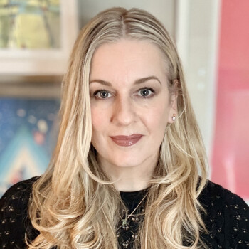
What I love most about children's publishing is that as an industry we are driving culture. The way a children's book looks and the message it sends captures a moment in time. I started with Penguin Workshop in 2014 as a designer, promoted to Art Director in 2018, and VP and Executive Art Director in 2025. I've seen a lot of growth and change in our imprint. The only thing that hasn't changed in that time is the drive to make the best possible books that we can. Penguin Workshop is always asking what's next, what's more inclusive, what hasn't been done yet.
From a young age I can remember being fascinated with design. I grew up in NYC, and I remember being in the car staring out the window noticing the lettering of the store signs. In elementary school I designed layouts on my bedroom walls with photos I clipped from magazines and ads from the 1960s that I bought from vintage shops. Many hours spent drawing led my mom to point me in the direction of graphic design and then on to art school. One of my first jobs was designing home video packaging for an art house film distributor. Later this led to another job doing the same thing but this time it included children's content. I fell in love with children's art house animation. As I looked to the future, my next natural career progression was children's publishing. I may have taken the long way here, but I feel like I found a home at Penguin Workshop.
Tinker is exciting to me because it evolved from a genuine joy of picking our favorite creators and manuscripts to publish. Steph Stilwell's book is a prime example of what we want these books to be. Her art is adorable, well considered, and tons of fun to read. What excites me most about this imprint is that because we are always going to be looking for what's next, we're not locked into a super specific style except that it should be fun, bright, colorful, and engaging.
When I'm browsing portfolios, what stops me in my tracks is consistency, volume, and versatility — an artist who can do characters as well as scenery. When I see a portfolio with a ton of consistently stunning art, it gives me confidence that they will take the manuscript and run with it and deliver a beautiful book.
If an artist is confident that they can work in multiple styles, I would love to see that. Sectioning their website so it's clear that each style is equally well executed is key. You don't want it to look like one of your styles is a hobby. Aside from that, websites do not have to be fancy. In fact, the simpler the better. I would also like to see a full Instagram page. I love finding work that isn't on their website to add to the pitch deck. I also like to hear about an artist's personal story in their bio. It really helps to connect artists to the right manuscript.
Demelsa Haughton is a rare and incredible talent. Tori Amos is a magical writer and delivered equally descriptive art notes. In Demelsa's hands, the story was taken to another realm. She makes every inch of the page feel like you have been transported. Every inch of the characters, from fingernails to shoes, and the most minor details in the settings, such as the shape of the window frames, are considered. These all work together to pull you into a place where you truly believe that a pink piano can fly.
The Who HQ series is near and dear to my heart. It is the first book series I worked on when I started as a book designer. Because this is a long-running series, it's easy to give a brief with examples of past books to point to and say, "Match that!" The art direction we give cover illustrators is first and foremost that the bobblehead is the star of the show, then working in the details and scenery around it. For the interior, which is 1-color line art, we typically use a classic American illustration style, but over the years I have started to mix it up and look at more loose or cartoony-leaning styles. As long as the artist is good at likenesses and imagined historic or non-fiction scenes, I'm willing to consider them.
The Little Engine That Could 90th Anniversary Edition does carry an enormous legacy, and we really wanted to get it right. When we were brainstorming big names to do this version, Dan Santat's name came up and I was like, "Yes! That's the artist! He's going to nail it!" He was given artistic license, but he had to stay true to the basic character descriptions. The only tricky part was the expression on Little Engine. She has to look confident and resolute but adorable. There was a lot of back and forth on the subtle tilt of the eyebrows, but we got there. I am so proud of how this book turned out and how well it continues to sell.
I think there seems to be a little more interest in art that looks like it's done by hand, and this includes digital artwork. I think people want to see the brush strokes whether they are by a physical or a digital brush; the little imperfections show that it was human-made. I'm seeing a lot of creators posting their process as proof their art was made by them. That said, I also work with a lot of licensed brands that must look polished and modern, so there is still plenty of room for all styles of art.
I'd love to see more realism for picture books that look modern but not stylized. It seems like there aren't a lot of new artists who are interested in that style and how it would translate into something fresh and not what we've seen before.
From Workshop, I'm really excited about Jessica Hische's third picture book in the Tomorrow I'll Be series, called Tomorrow I'll Be Happy. Her inventive hand lettering once again takes center stage, and I think it's her best one yet!
The one piece of advice that I would give an illustrator serious about building a sustainable career in children's books is to stay ready, so you don't have to get ready. Keep drawing, keep getting better, and keep adapting. Right now, adapting means making sure your website and Instagram are updated, and your contact information is easy to find. In the future, that could mean something entirely different. It's important to stay on top of where and how Art Directors are finding artists.
From Rise, Joshua David Stein and Christopher Silas Neal have teamed up for a brilliant picture book called The Middle. The storytelling in both the words and the pictures and the questions it asks are equal parts simple, complex, and joyful.
For Tinker, everyone needs to pick up a copy of The Big Book of Fun Fanciful First Words by Suzy Ultman. It is jam-packed with Suzy's whimsical objects, letters with personality, and tons of color. She is working in a new colored-pencil style for this book that I just love!
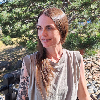
I loved drawing, painting, collage, photography, and always admired art as a kid. But more than anything I came to realize I enjoyed composing things, whether that was through the lens of a camera or arranging the furniture in my bedroom. The principles of composition are shared between all types of art. The enjoyment I got by making decisions about what would go where eventually led me into design.
When I started going to school for design, I hadn't settled on what area to focus on. At the same time I entered design school, I became a part-time bookseller in a children's department so I was staring at books all day and it reminded me how much books meant to me a kid. When I encountered Penguin during an intern fair at my college, I made a connection. I was able to get hired as a part-design assistant instead of an intern and I've been part of the same team ever since!
The biggest change is that I am frequently collaborating with a junior design member of my team. In that position, I'm trying to help another designer realize their own vision as opposed to my own.
Emails, meetings, meetings, lunch break, meetings, meetings, emails, design. I'm only exaggerating a little! But those meetings are important, it takes a lot of discussion to unify the direction of a book.
In a picture book, you zone in on every detail on every page. There are so few pages that every moment seems big. In a graphic novel, you have to take a step back and look at the long view. Asking questions like: Is this clear? How does this flow? There is a lot more letting go and having the artist feel it out and only stepping in occasionally.
What actually stands out to me when you list these artists like this is how different each one of them works. This is something I love about the picture book process, every book is unique in how it comes together. That customized approach keeps me feeling creative and inspired because I can't just sit back and do things the same way I've done before.
Typically I look for consistency in line work/color/etc. Having a few different styles is OK, but for newer illustrators it can make me pause because honing a style takes time. I also always advise illustrators to have some pieces that feature the same character because most picture books feature sequential storytelling with recurring cast.
Editors are our collaborators, they bring the project to us and then trust in us to help them shape and elevate it. For our team, it is an incredibly collaborative process with a lot of discussion (all those meetings I mentioned above!) and once sketches starts coming in the art director and designer take the lead in communicating with the illustrator.
I'm lucky enough to be working at Viking Books for Young Readers which is the home to beloved books like Madeline and Corduroy which I too loved and I get to be part of a direct legacy of those books.
I've loved comics for as long as I remember, they have always been part of my reading. So I find it exciting to be part of that unique medium and also help introduce it to kids and colleagues.
Denise Cronin (art director at Viking Books for Young Readers at the time) hired me as a design assistant and I truly grew up while working for her. She was a patient and thoughtful art director who wanted me to feel ownership and pride in a book design. I worked with her for more than 15 years until she retired.
Be open to feedback. The book publishing process is a collaborative one between an editor, designer/art director, and the artist. My feedback is about helping an illustrator communicate their ideas in the strongest way possible.
I'll mention two. The first is a picture book by Lenny Wen called Sister Scribbles. It will be coming out on August 25 and features a rivalry between two sisters who are artists. The way Lenny plays with the depiction of the girls' drawings and of self-doubt that artists feel is spectacular.
And I must mention an upcoming graphic novel The Girl Who Loved Monsters which is hitting shelves on July 28. This is exactly what I enjoy in comics, it is a little bit scary, a little bit funny, and features a great cast, witty dialogue, and dynamic art.
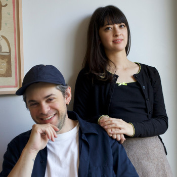
AW: The biggest inspirations are our two children, aged six and three. We spend a lot of time reading to them and were motivated to publish books that they would want to read again and again. We’re big fans of Japanese children’s publishing. It has a real creative freedom that we love.
SV: Huge numbers of people are reading Japanese fiction in translation and Manga is a massive global industry now. We hope that the children’s market will similarly look towards Japan for its beautiful picture books.
AW: It’s been quite natural really. Sam was a brand and marketing person in publishing for many years and has a really good sense of publishing as a business. I am an illustrator and a great lover of illustration and so was always going to take the creative lead! There’s crossover of course – we’ve both taken on the role of editor for different titles.
SV: First and foremost, we make books that we think children will love. We’re not too concerned about the ‘right’ way of doing things, either!
AW: I think a lot of it is down to curating the list and publishing illustrators we feel inspired by.
SV: You just know! As a husband-and-wife team, we have a really clear sense of each other’s taste.
AW: If we both love something, it’s right for Do Re Mi!
SV: We have a brilliant editorial director, Fiona Scoble, who brings a huge amount of picture book and fiction experience. She has a deep understanding of storytelling and can tell just what a book needs to make it sing. Polya Plavinskaia is our head of design. She was previously art director of Samokat in Moscow and has wonderful taste in illustrators and a real boldness to her approach. We also work with some brilliant and very experienced freelancers and partners for things like production, foreign rights and sales.
SV: I could describe one, but it might not bear any resemblance to any of the others. Each project is totally unique! Some start with an illustrator we love, and we discuss ideas with them. Sometimes we develop an idea in-house and find the right team for the job. Sometimes we start with the text. Whatever the approach, there’s lots of creative collaboration involved.
SV: The greatest challenge I think has been around building our network of partners when we don’t yet have any books to show. Distribution, warehousing, sales teams in different territories, foreign rights sales – these all need establishing if a business is to sustain itself properly. It’s been really rewarding to start getting positive feedback from bookshops and on social media.
AW: We don’t see these two things as being in conflict. Making interesting books that children want to read is a very commercial idea!
AW: The most important things to us when choosing illustrators is a unique creative voice and child-friendliness. When book shopping for my own children, I became bored with the same illustration styles being represented again and again. So we like to make more daring choices when choosing illustrators. But we don’t want to be so artsy as to alienate the child reader. It’s equally important to us to appeal to children and to for the illustrations to be easily readable. Luckily, there are so many wonderful and exciting illustration out there that bridge that gap!
AW: I’m really excited about How to Be a Cat, written by Sam and illustrated by Yoshiko Hada. It’s a board book about a boy mimicking a cat. We’re really inspired by play in general and often watch our kids for ideas. Yoshiko Hada is a Japanese artist with a lovely expressive style who perfectly captured the spirit of the story.
AW: As a small independent publisher, we’re happy that we can take more risks with new illustrators and also have the capacity to work with them closely on each project.
SV: There’s lots of variation in our days at the moment. Splitting our time between creating books and running the business is sometimes challenging but fun, in its way!
AW: Each stage of the publishing process is very creative, from considering the overall shape of our list, through editing and making production decisions.
SV: Our launch list is largely made up of board books and picture books, but we’re really thrilled to have signed up a couple of books for slightly older readers for later in the year. More anon!
AW: When developing your portfolio, lean into what makes your work unique!
Accessed Daily by Leading Art Buyers
Published Book Highlights


Testimonial
CI is a wonderful site!
Patricia Keeler - Children's Illustrator