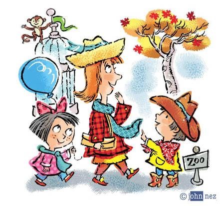
1950's Retro - Digital style

This new book I am illustrating is a fun story set in New York's Central Park Zoo, written by Steve Metzger, published by Tiger Tales.
The real challenge to this project is trying to find a new synthesis of a retro 1950's style and a contemporary digital style.
The art is based on pen brushed line, done on textured watercolor paper. The colors are bright and bold... with patterns and textures done in photoshop. I first looked carefully through the amazing artists of the 1950's, whose work seems very much akin to this current age.
I was looking through magazines from the 1950's and found some amazing samples of Alice and Martin Provensen's illustration work from the 1950's. It still looks very contemporary. Maybe that's because 1950's design seems so similar to our own decade... or maybe it's just a timeless classic. Of course they didn't get to use digital tools to embellish their amazing designs, but I guess their work will last the ages.
Some of the hallmarks of the graphic style might be thought to have iconic simplicity, overprinted color areas and simplified color backgrounds isolated by white space. I tried to get some of that same look, along with an added contemporary cartoon edge. I hope I've succeeded.
The parallels between 2010 and 1950 seem clear. The last time I dropped by Crate & Barrel I was equally impressed at how the home furnishings of today seem steeped in 1950's design. I was watching the 1950's classic movie 'Monkey Business' and was astonished at how the styles of clothes, glasses and furniture seemed identical to styles of today. Maybe it's sunspots... or just history repeating itself. Maybe it's because people are nostalgic for the simpler, happier times of the 1950's, when life seemed so much easier to figure out and times were good.


