How to become a children's illustrator

So, you’ve decided you would like to become a professional children’s illustrator. Awesome! It is an extremely rewarding career and who wouldn’t take pride in seeing children around the world enjoy their artwork. Could you be the next Quentin Blake, Beatrix Potter, Maurice Sendak or Oliver Jeffers?
Education
No formal qualification is required to become a children’s illustrator, however it may help to shape and refine your style by enrolling in art college or attending workshops. There are also many and various online courses to consider. Publishers typically hire children’s illustrators on a freelance basis and the decision to hire is almost exclusively made based on the strength of your portfolio.
Refine and establish your own style
When looking to become a children’s illustrator, finding and understanding your own voice in the marketplace is crucial. Does your style sit well amongst other work currently being published? You are aiming to find a happy medium where your work is both unique and relevant. We strongly recommend visiting your local bookshop (or browsing our published books gallery) to familiarize yourself with what’s currently being published. If you find that your work doesn’t sit alongside popular titles, try to identify why.

Children's Illustrator: Freya Hartas
Suitability
Artist Vs. Commercial Children’s Illustrator – You may think they are the same, but the key difference is “commercial”. Fine art has no specific remit other than to be visually stimulating. This rarely transfers into the world of children’s publishing.
Is your work more suited to hanging in a building’s reception or bringing to life an editorial piece? Not everyone is suited to children’s publishing. Ultimately, you need a style and technique that speaks to children (and commissioning editors!).
Subject matter is key; nudity and violent imagery are not found in children’s books – so do not include them in your portfolio if you wish to become a children’s illustrator.
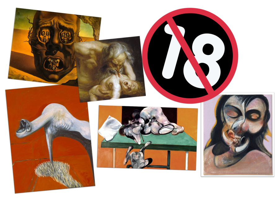
Dali, Rubens & Francis Bacon (above) would have made unlikley children's illustrators.
Identify your audience
To become a children’s illustrator, knowing and understanding the needs of your target market is crucial. Children’s publishing is defined by the following age-groups:
- Board (0-3yrs)
- Picture Books (3-7yrs)
- Early Readers (5-9yrs)
- Chapter Book (6-9yrs)
- Middle Grade / Juvenile Fiction (7-12yrs)
- Young Adult (13+)
Visit your local bookstore and find the age group / area that your work is best suited. Make a note of the titles you were particularly drawn to and who published them. Look up each of the publishers online and familiarize yourself with their lists.
Childrensillustrators.com regularly interview art editors & publishers. Be sure to read these to gain a better understanding of what they look for and how they work. Establish what they commission within the market you are aiming for and tailor your portfolio in response to their respective needs.
Subscribe to Publishers Weekly’s Children’s Bookshelf to keep abreast of new titles coming onto the market and identify trends.
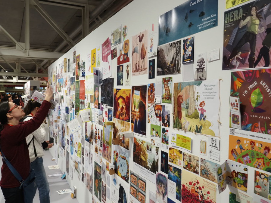
If you are certain the children’s market is for you then a trip to The Bologna Children’s Book Fair (sponsored by Childrensillustrators.com) can be an extremely rewarding and valuable experience. The annual Italian fair is the world’s leading professional event dedicated to the children's publishing industry attracting over 1,400 exhibitors and more than 29,000 visitors from around 80 countries. There are numerous and varied talks, workshops and exhibitions to attend. Warning: The fair can be somewhat overwhelming for first time visitors – look to meet up with other illustrators and enjoy this unique experience (and the gelato!).
Subject matter & timings
So, you have refined your style and identified the age-group you are best suited for. Now try to identify common themes, subjects and narratives – this should form the foundation of your portfolio. Commissioners should be able to easily relate to your work and place it amongst their own lists.
Set yourself mock briefs, below are some examples to give you a steer. Select the age-group you are best suited for and start to create work at a professional standard in response to the brief.
If you are just starting out, don’t worry about time constraints. However, once you are happy with your style and technique, you should start to analyse how quickly you are able to create each piece of art – now multiply the time it took by the amount of art typically needed for your target project type. For example, a typical picture book is 32 pages, made up of 12 Double Page Spreads, Cover and sometimes endpapers. Each publisher will have their own schedule and you will need to factor revision requests when completing a commercial project.
a) Picture Book
Synopsis: “Thread Bear” - Despite being offered a plethora of shiny new toys, Thread Bear remains the child's firm favourite and best friend.
*No need to illustrate the whole book, look to create a cover + 2-3 spreads.
Format: We recommend 8x10 or 10x8
Tips:
- Convey emotion in the faces of your characters.
- Show a sense of movement to draw readers into the story.
b) Non-Fiction
Examples: Natural History / Transport / Cities / Maps & Geography / Science
*This field doesn’t require specific page layout examples. Concentrate on providing clear and accurate representations of your chosen subjects. Create sets of related content.
Tips:
- Convey information with a human touch.
c) Middle Grade / Chapter Book
Synopsis: A school run by vampires
*Cover + 1-2 Black & white full-page illustrations.
Optional extra: Supporting spot illustrations
Format: We recommend 6x9
Tips:
- Bring excitement to your covers!
- Adventure, mystery and humour are common key ingredients to a successful middle grade illustration / story.
- When adding characters, keep in mind that children often connect with their own age-group or slightly older.
d) Young Adult
Synopsis: A relationship torn apart by war
*Cover only (consider a full wrap)
Format: We recommend 6x9
Tips:
- Text placement and clarity is key on both cover and spine.
- Consider and experiment with conceptual ideas.
Diversity and inclusion
The publishing industry is at the forefront of ensuring equal representation for all. Keep your figures/characters as varied as possible to widen your appeal and help fulfil this important remit.
Lettering
If you can provide hand-lettering, do so! Publishers love a creative type solution for covers, chapter headers and resource labelling but avoid if this if not your strong point. Hand lettering can lift a piece when executed well, but don’t worry if it’s not your thing!

Layout: Text and key detail placement
When creating your artwork, consider where you will place text if applicable. If you are illustrating a double page spread, keep key details away from the page gutter. Factor in adequate overdraw/bleed if needed.
Resolution and layers
If working digitally, pay careful attention to your settings. Working in CMYK will help to prevent disappointing colour reproduction in print (you may also want to investigate calibrating your monitor to accurately display colours).
Aim to work in as high resolution as practical, you should see 300 DPI as your absolute minimum.
Keeping your main elements on separate (and labelled!) layers is good practice and can save a lot of time and energy if the client requests changes. Many publishers will ask for layered files.
If rendering traditionally, a good high-quality scanner is a must. We also recommend cropping and enhancing in post-production if needed. Poor quality, shadow cast photos are often a sign of an amateur portfolio and will ring alarm bells with commissioners.
Consistency
Unless you are aiming to be a copy artist, where you need to demonstrate the ability to work in multiple styles, we highly recommend keeping your work as consistent in style as possible. Group related work rather than “peppering” your portfolio with many differing approaches. Childrensillustrators.com offers an “image set” feature that is perfect for separating styles and techniques.
You should be able to demonstrate to a publisher that you can maintain a constant look/feel throughout a title. Avoid characters unintentionally changing in appearance, this can often be a challenge when changing perspective/angles. The illustrations should remain consistent in style and tone.
Formats
Try to mirror the market you are aiming for. Avoid filling your portfolio with formats rarely seen within your chosen niche, this is especially relevant when pitching a book dummy (See: How to publish a children’s book).
Picture & Board Book examples:
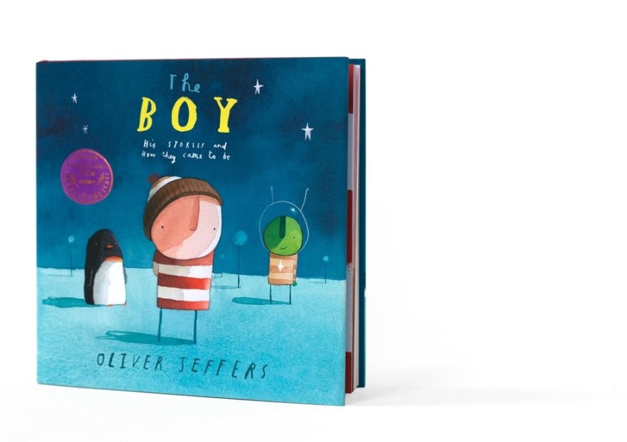
The Boy: His Stories and How They Came to Be by Oliver Jeffers
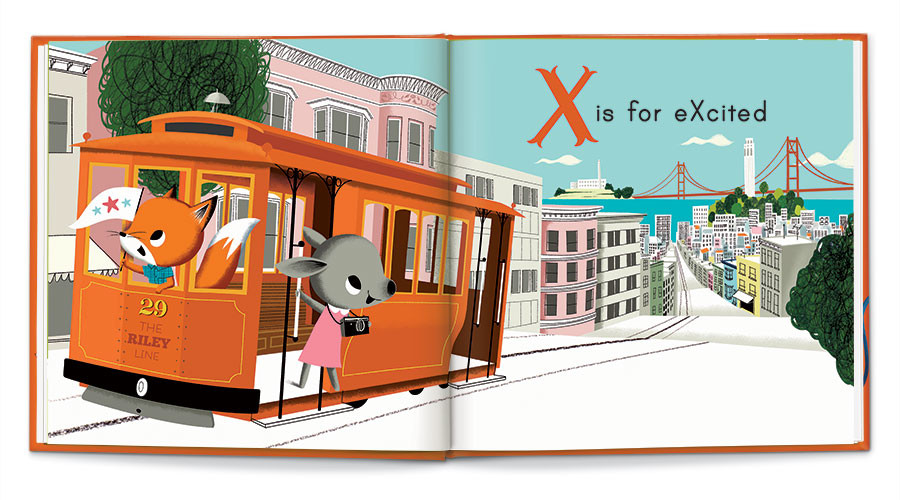
Me is for Me, illustrated by Nicola Slater
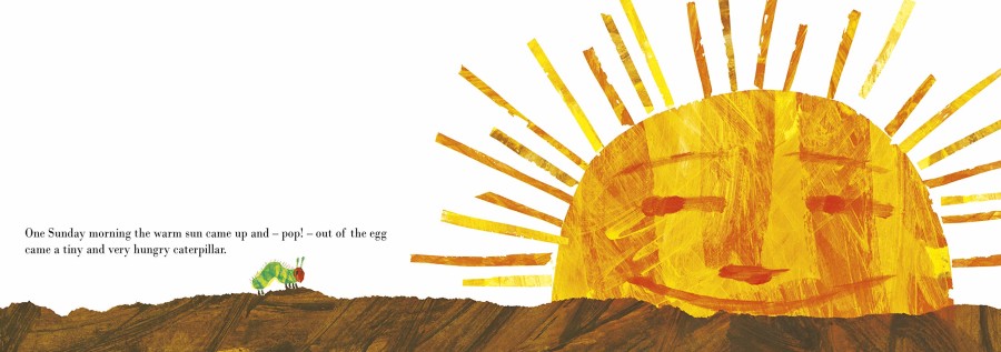
The Very Hungry Caterpillar by Eric Carle
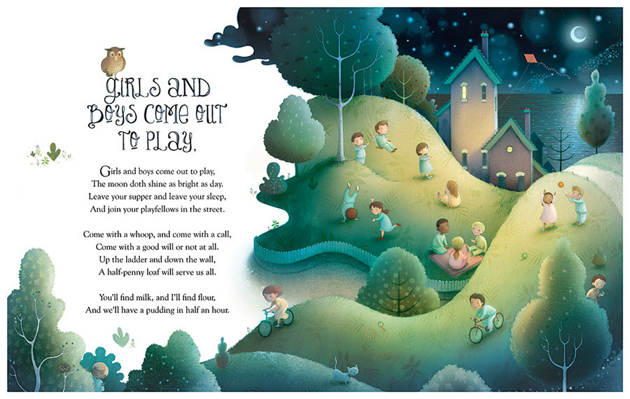
Double page spread by Richard Johnson
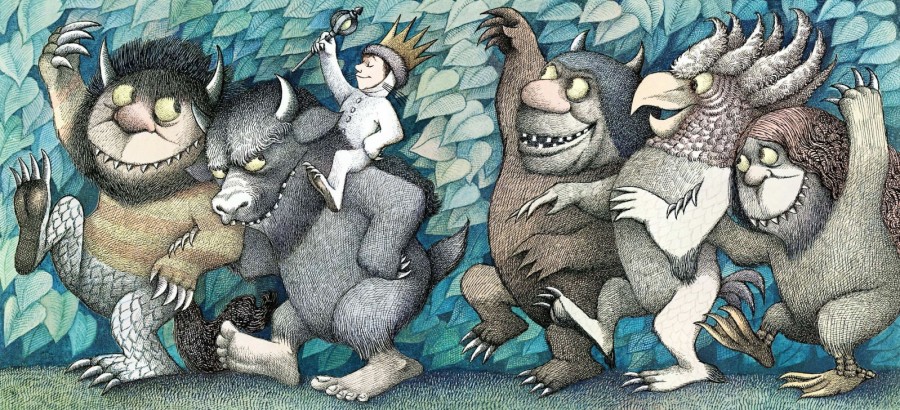
Where the Wild Things Are by Sendak, M.
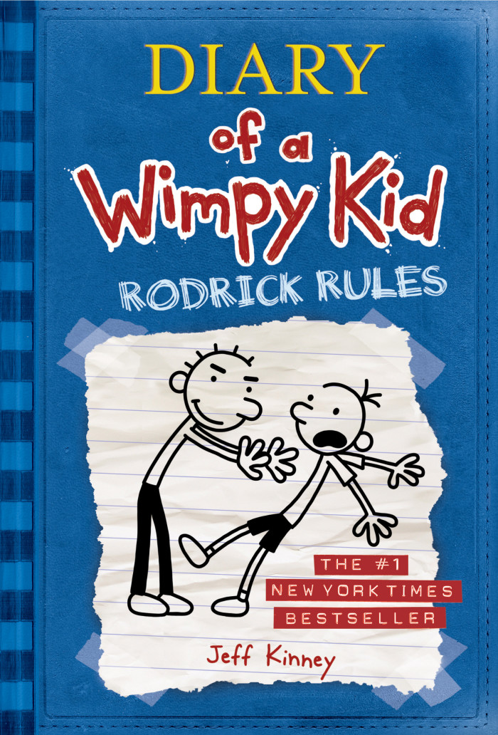
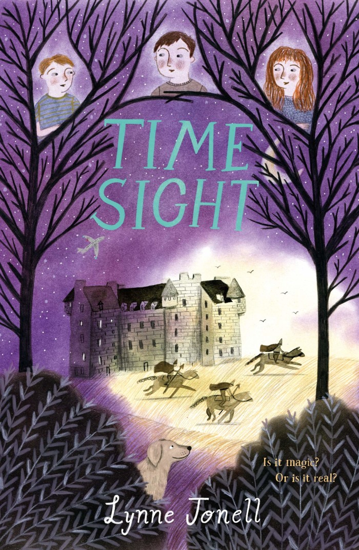
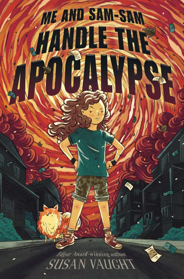
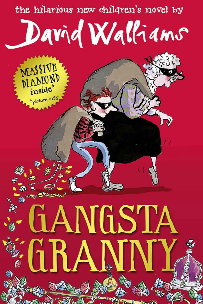
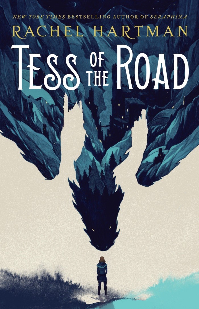
Middle Grade books:
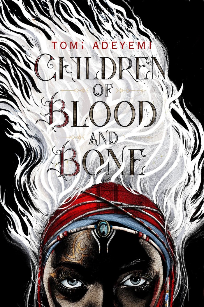
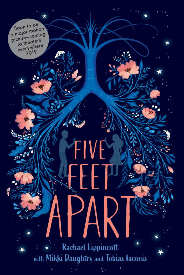
Young Adult covers:
Peer appraisal / portfolio review
Gaining a professional and honest opinion on your work can be invaluable when looking to become a children’s illustrator. You can find below several art directors, editors and agents offering paid reviews. Alternatively, if you have access to working professionals that are already successful (illustrators enjoying recent success may often be most in tune with current trends) in the field you wish to enter, see if you can meet up and exchange ideas, view each other’s portfolios and learn from one another.
- Fig Taylor
Fig Taylor has been advising illustrators on how to make the best of their portfolio since the 1980’s. Author of How to Create a Portfolio and Get Hired: A Guide for Graphic Designers and Illustrators, Fig has run her own illustration agency, and subsequently worked for several others, giving her a wide overview of the industry and a wealth of valuable experience. Fig has lectured on professional practice at over fifty UK art schools. She is a regular contributor to The Writers and Artists Yearbook.
- Giuseppe Castellano
Giuseppe Castellano is an award-winning art director, illustrator, and designer. With over 18 years of publishing experience, the majority of which were spent as an art director at Penguin Random House and Simon and Schuster - he has worked with a wide variety of illustrators across a myriad of titles.
Giuseppe earned a BFA in Illustration from the Rhode Island School of Design, and an MFA in Illustration from The Fashion Institute of Technology. As an illustrator and designer, he is well-versed in both traditional and digital media.
He is also the founder and creative director of The Illustration Department, a global leader in personalized online education for illustrators of all experience levels.
You can learn more about his school, read testimonials, and view the alumni showcase by visiting illustrationdept.com.
Key qualities
Becoming a children’s illustrator is an exciting journey. Here are some key qualities you should look to emulate or aim for:
Imagination – Unleash your creativity!
Emotional connection – Look for the awwwww or ahhhhh factor!
Fun – Keep your artwork full of fun!
Consistency – It’s all in the detail!
USP – Find your voice.
Know your market – Create a targeted portfolio.
On time – hit those deadlines! Publishers love to work with illustrators who can keep on track and deliver on time. Missing deadlines can cause headaches and stress – remember you are part of a wider supply chain that includes print, distribution, and marketing. Take time to evaluate a project workload and schedule before committing. Commissioners will appreciate you flagging schedule concerns before accepting a project and may be able to extend the deadline to accommodate - this becomes a lot harder once the wheels are in motion.
Output – stay busy! Set yourself a goal to create a new piece of work each day.
Shine & curate – show around 20 pieces of your best work (you can expand on this using the image set feature if showcasing on Childrensillustrators.com) and group related work/styles where applicable (keep different styles separate). Archive your weaker work. Just because you like a piece, doesn’t mean it should be included – ask your peers. Show consistency but avoid repetition.
Stay positive – many creatives are their own worst critics. Turn to your peers for an honest portfolio review, constructive feedback, and support. Staying positive is also something you should project, so avoid posting negative comments on social media (you don’t know who’s reading it!).
“I have no work. This sucks”
…won’t instil confidence from a commissioner but,
“I’ve created these self-initiated illustrations while I’m between projects”
… could inspire that next big job! Successful people project success.
Promotion
Established in 2004, Childrensillustrators.com provides a comprehensive promotional platform for professional children’s illustrators and reps. We regularly engage with publishers and brands worldwide, ensuring your work is in front of commissioners.
You may want to view testimonials from illustrators, reps and publishers here who all agree, Childrensillustrators.com is the number 1 platform for professional children’s illustrators.
Are you a professional children’s illustrator looking to secure new projects? Upload your portfolio to Childrensillustrators.com today.
