
From Blue Skies to Golden Fields: Why I Chose Warm Colors for This Scene
Hi, I’m Hema✨
In this post, I wanted to share something I often think about while illustrating for picture books: how color choices affect the mood of a scene.
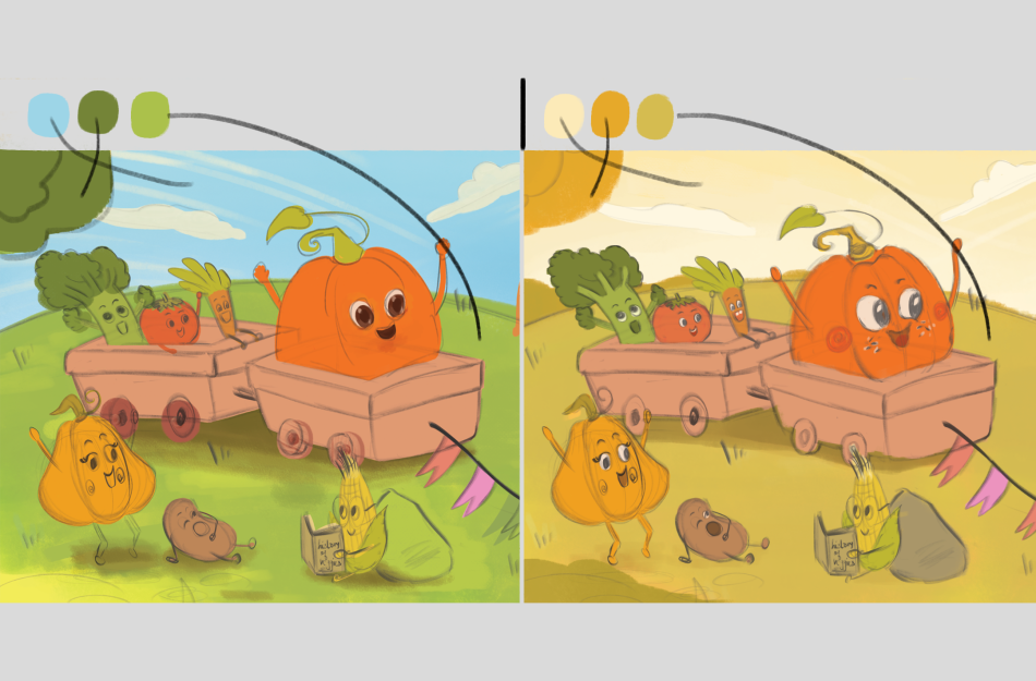
The image of this post shows a comparison of the same illustration - a cheerful veggie patch from a story about Pumpkin and his vegetable family.
The first version uses more “expected” colors — blue sky, green grass, bold tones. It’s bright, bouncy, and playful.
But in the final version (on the left), I limited the palette to the yellow-orange range of the color wheel. I skipped the classic blues and greens to create something warmer, softer, and more cohesive. The scene now feels like a sunny late afternoon — cozy, calm, and filled with that gentle glow I often associate with safety, happiness, and the kind of wonder you find in really great picture books.
As a children’s book illustrator, I love exploring how subtle choices like this — in palette, shape, and atmosphere — can shift the emotional tone of a page. Especially in kidlit, where young readers respond so deeply to visual cues, color becomes a storytelling language of its own.
This scene is part of a new book in progress, and I can’t wait to share more from it soon!
Thank you for taking a peek behind the scenes 💛
– Hema