Monique Sterling
Senior Designer, Penguin Random House
Did you grow up in a creative household & how did you become a book designer?
Growing up, my parents always encouraged my creative side by appreciating my many (way too many) drawings. My Dad is also an artist, a woodcarver, so I spent a lot of time as a child just watching him work. And as I grew older, I always gravitated towards art classes and art related events, from elementary school all the way to college. I majored in Graphic Design at the Fashion Institute of Technology, then started my career as a general designer in several industries for a few years until I grew interested in creating books for children. So, I sent out application after application until I eventually landed an interview and was offered a Designer role at Macmillan.
Could you describe your role as book designer and give an overview of what a typical day can involve?
My core responsibility as a designer is to take a manuscript and create an appealing package that fits the tone of the story. That includes choosing and working closely with illustrators for picture books and guiding them as they develop their beautiful artwork. And for YA novels, middle grade, and nonfiction titles, I focus on the interior design—creating engaging layouts using text, photos, doodles and/or spot art. On a typical day, I’m usually reviewing artist sketches with editors and writing up notes for revisions, designing and laying out picture book mechanicals and novel interiors, reviewing proofs for final printing and making text corrections for book passes.
As Senior Designer at Penguin Random House you work on picture books and nonfiction titles that celebrate diverse characters. Could you select three recent titles you've designed to share with our audience?
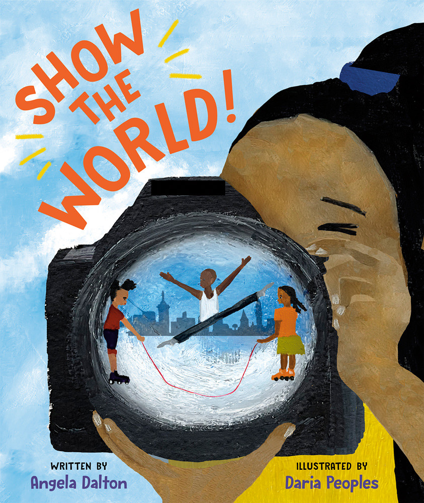
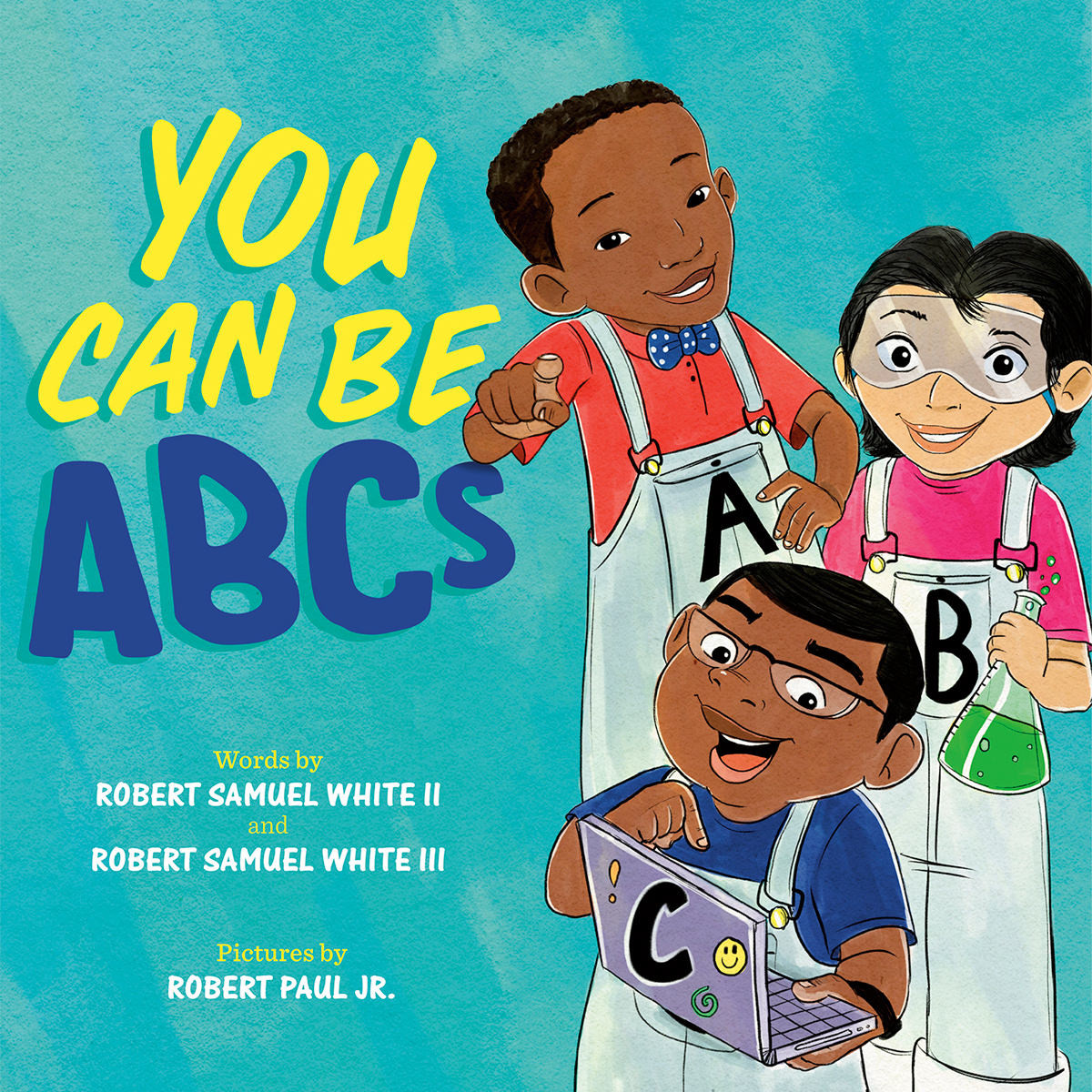
Absolutely! Every day, I have the opportunity to work on books by incredible creatives. And the most recent titles that were a real delight to work on are Show the World by Angela Dalton and illustrated by Daria Peoples, My Love for You Is Always by Gillian Sze and illustrated by Michelle Lee and You Can Be ABCs by Robert Samuel White II, Robert Samuel White III and illustrated by Robert Paul Jr.


Show the World and You Can Be ABCs inspires readers to break from the norm to be bold, creative and explore the endless possibilities of all they can be. Both titles showcase young Black narrators and kids from different backgrounds that BIPOC children can relate to.


While My Love for You Is Always is a sweet and tender love letter from a mother to her child describing all the different ways love can be expressed through our senses.

And this conversation happens as they prepare a traditional Chinese dinner together.


Every designer has a different approach and way of collaborating, how would you describe your process?
I tend to collaborate based on an individual’s learning style. We all absorb information differently, whether it’s through visuals, written text, audio, or a do-it-yourself approach. This means, if I’m attempting to explain an idea to an artist or teammate and they can’t quite understand what I’m trying to convey, I’ll then try to communicate the concept in a different way. Either by creating a quick visual mockup or providing a photo reference. Or perhaps explain it verbally in a meeting, as opposed to through email. And the same applies vice versa. If I’m having a hard time grasping an idea that’s being explained to me, I might ask the person to either reiterate it differently or provide a simple drawing or chart, which helps me the most as a visual learner.
Part of a designer's role is to ensure important moments in the story are maximised. Could you share one or two examples of how you've achieved this?
When we think of highlighting a particular point in any story, we tend to think BIG. And changing the scale of an object or text is usually the easiest way of achieving this. But sometimes, just seeing something unexpected is enough to draw the readers eye to a different spot on the page, like a bold color or the lack of content. For example, when trying to pull attention to central points on a spread, taking away the excess can be the easiest way to do this. Meaning, removing any extra background elements that aren’t necessary in conveying the message on that page and embracing the negative space that remains.

What are some of the technical details you particularly enjoy overseeing? Could you show us some of your favourite finishing touches / treatments?
I really enjoy the jacket and cover design stage of a book project. I tend to get a bit carried away with color options and comps, but I like the collaborative aspects of sharing options with the team and pulling different elements from each comp to create the final look. The lettering created for My Love for You Is Always is one of my favorite type treatments, particularly because I got a chance to work with my hands and start with basic sketches before moving onto the final rendering.


Here is the final result:


What are three things that illustrators should a) include and b) avoid in their portfolio?
Speaking specifically for picture books, we always look for variety in an artist’s portfolio. So, we look out for drawings of children and people with movement, different perspectives, and variation in expression. Other elements that are important—depending on the style—are lighting, variety in color, and consistency in scale and proportions.
Describe the most uplifting & inspiring project you've worked on.
Call and Response: The Story of Black Lives Matter was unlike any book interior design I’ve done before. It was both uplifting and heartbreaking as it tells the story of what sparked the movement, key historical events and figures, and how it’s shaped our country and its people. The photos by New York Times photographers are so powerful and show the resilience of Black Americans despite adversity, systemic racism, murder, and discrimination. Laying out the text and photos was an emotional, yet inspiring process and I’m so happy with how it all came together.
What are some of the things that have really inspired you lately?
Being outside inspires me a great deal. I try to take daily walks around my neighborhood, and I always find something new and beautiful that I didn’t notice before. Taking the time to slow down and clear my mind helps me to pay attention to the small details. And in doing so, I can take my time to reflect on things that bring me joy and oftentimes stumble upon an unexpected and new idea.
Is there a good (or bad) piece of advice you were given early in your career that was helpful to you?
“Ask questions!” I struggled with this early on as I felt like I always needed to prove myself and figure things out on my own. But a former coworker, who’s now a very dear friend of mine, once told me it’s okay to just ask. Ask as many questions as you need to in order to get a full understanding of what’s being asked of you. As the saying goes, "You don’t know what you don’t know". So, it’s better to ask (potentially nag) and do a great job the first time around than to sit in confusion, waste time and probably start from the beginning.
