
Luana Asiata
Creative Director, Scoop magazine
You originally hail from beautiful New Zealand but have now made London your home. Can you tell us a bit about your career background and how you landed your current position as Creative Director for Scoop magazine?
My background is in fine arts, I studied painting at Elam School of fine arts at Auckland University, New Zealand. After finishing I moved to Sydney and landed a job in advertising for News Limited. I realised pretty quickly that newspaper advertising wasn’t for me. I wanted to do a bit of travelling so I moved to London and started work at TNT travel magazine as an Art worker, it was fun, but I really wanted a more creative role and liked the idea of commissioning illustrators and photographers, so I landed a job at RBI as Group Art Editor for Personnel Today. It was a diverse role working across 4 editorial titles and covered conferences, marketing and events.
After 18 months I stepped into the world of fashion working as a Designer for Drapers magazine covering all the fashion shows, creating look-books and art editing. After a year I went freelance working on a range of projects from corporate branding, retail, creating my own textile patterns, web and editorial design.
My friend Sharon King-Chai mentioned there was a part-time design role at Scoop and recommended me to the publisher and founder Clementine Macmillan-Scott. I met with Clementine and Sarah Odedina (Editor-in-Chief) and I was really impressed with what they were doing, I loved the fact they were producing original content, commissioning amazing illustrators and inspiring children to read. Scoop was approaching its first year in publishing and I was excited to be part of the team.
Scoop is a super-fun bi-monthly printed magazine for 7-12 year old kids. In a digital age, it's heart-warming to see how successful publications like Scoop are - what is it about the print format that children love?
The love for print is still very much alive and I think children really like the physicality of holding a magazine, turning pages and keeping it as a treasured item.
It must be exciting to be a part of the Scoop family – can you tell us what a typical day as Creative Director looks like?
It is exciting! We all work remotely so a typical day for me would involve checking emails in the morning, replying to any queries from the team, looking at sketches that have come in from artists, going through my to-do list and panicking that I’ve only managed to complete 1 out of 10 items on my list. Coffee normally helps at this point, once my brain has kicked into gear I’ll go through the content that’s in for the issue. I like to read all the stories first, that way when I start looking at illustrator portfolios I can match them to the story and hopefully create a clearer picture in my head of how the entire magazine could look.
Once I've decided on a match, I'll create a draft layout in Indesign, type up a brief and reach out to the illustrator. It’s a wonderful process working with artists, they have the ability to inject life onto our pages with colour and creativity and it really does enhance the joy of reading and celebrates the story. I try to give illustrators as much freedom to create artwork that they love, we often get the best results that way.
Comics and magazines are absolutely key in engaging children in reading, but how do you strike the right balance of fun and education?
We're so lucky to have amazing writers and contributors that create engaging content that is fun to read and is educational without being too in your face and boring. Content is key!
Scoop covers are instantly recognisable by their bright, bold and beautiful designs – can you share your top three covers with our audience and give an insight into the creative process behind them?
Crime issue 12: The crime issue was packed full of amazing content, stories about Victorian prisons, Graffiti and WWII spies. I knew I wanted a central image and thought of the crime scene chalk outline of a person, dog or a face, using a limited colour palette, black being the dominant colour. It needed to look different from the previous cover which was colourful. I chose Lee Hodges work because of his poster style and I wanted the cover to have that same quality.
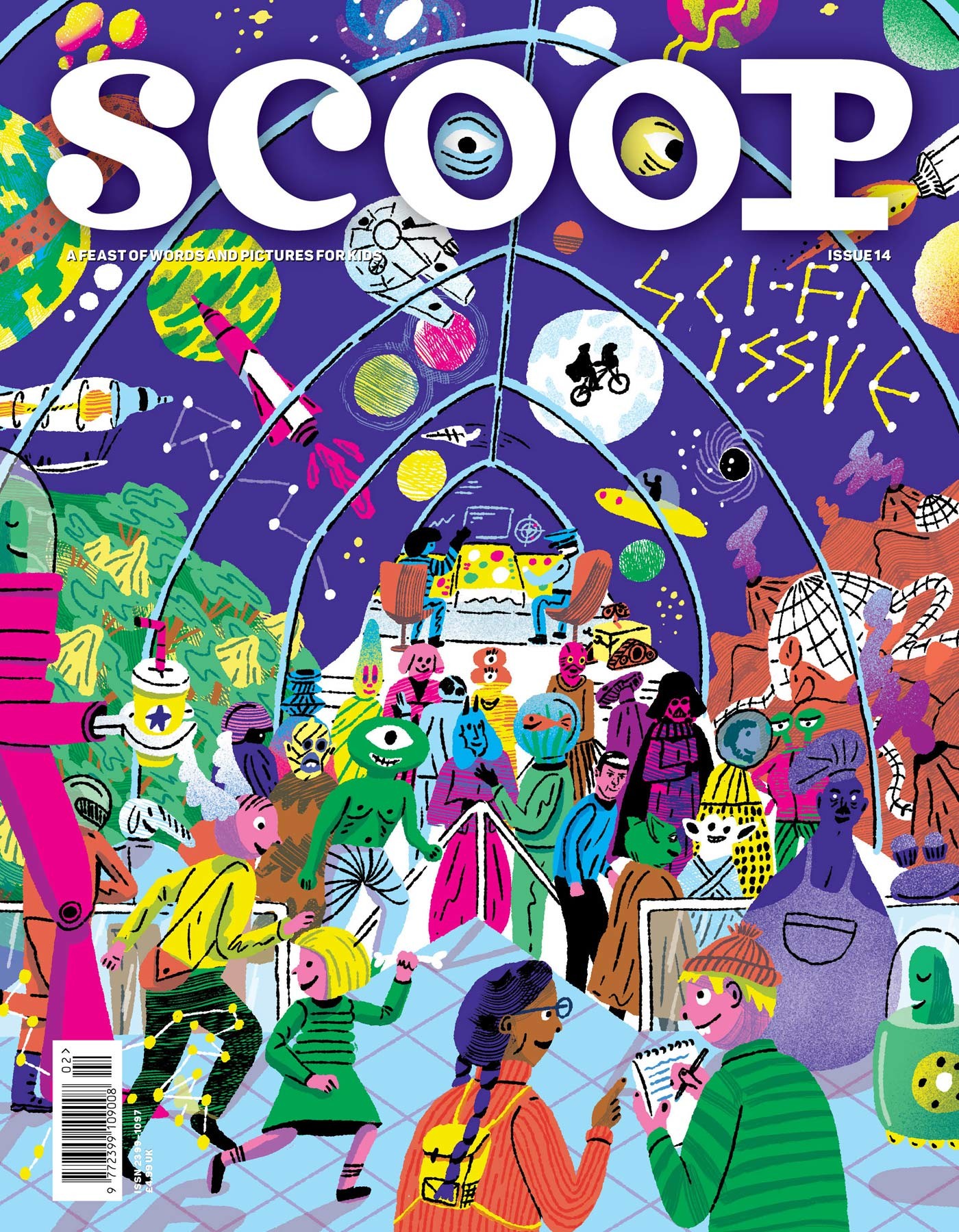
Sci Fi issue 14: I really wanted to work with Aart-Jan Venema, I loved his Green Man illustration and when he agreed to do the cover I did a little happy dance. Sci-Fi is such an interesting theme and I’m a huge fan of classics like Star Trek and Battlestar Galactica, so the brief was to create a real Sci-Fi ‘feast for your eyes’. The cover was filled with weird and wonderful creatures, aliens and imagery from the stories inside the magazine, so it was an amazing mix and Aart-Jan added Sci-Fi classics ET, Star Trek and Star Wars.
Feast issue 15: This is the first time we used photography on the cover. The theme was food, so it needed to look festive and indulgent. I started looking at compositions first and I wanted to create a centrepiece of food with a nod to the festive season, so I came up with the idea of a food wreath made of sweets, chocolates and strawberries – it needed to be colourful and appeal to kids. I worked with Scoop photographer Maud Craigie in the studio to construct the wreath which was great fun and the best bit was creating the back cover shot, we got to eat the wreath.


Each issue of the magazine embraces a different theme. Can you select a few pieces from your current Women's Issue and explain how that particular writer / illustrator really brought the theme to life?
The Secret Sinking by Lydia Syson is such an emotive piece, it’s a true story told to Lydia when Emilie was in her seventies and living in a nursing home in Belgium. The story is heart-breaking about young Emilie and her family in World War Two on the ship Lancastria which sank after it was bombed by the Germans near a French port. I commissioned Katie Harnett to illustrate the piece and what she produced was both dramatic and sombre, it really felt like you were in the story.
Trailblazers Trail Game is one of my favourites, I commissioned Carol Rollo and she really brought the theme to life with her bold colourful, dynamic style. She did a fantastic job.


For those illustrators looking to appeal to Scoop magazine, what portfolio advice would you offer?
I think it’s important to read Scoop from front to back, get a feel for the style of writing and audience its appealing to and look at the different illustration styles used in the magazine and then finally look at your own work/style and ask yourself is it a right fit?
Describe some of your most enjoyable creative collaborations.
I really enjoyed working with Will Drayson on Crime issue 12. Wills style was perfect to illustrate a story about a Japanese chemical company dumping mercury into Minamata Bay. Strange things began to happen in the town, backward walking cats, suicidal crows. Will said to me that he could down-play the colours and make them less psychedelic but that was the very reason I picked Will because of his psychedelic art and his skill at creating multi layered scenes and intricate detailing. The final image screams toxic waste and I love it.

In addition to being Scoop’s Creative Director, you are also a talented Pattern Designer. What is the inspiration behind your current designs and could you select a few of your favourite samples to share with us?
The inspiration behind my current designs came from a recent trip to Ireland. My husband’s family live in a small coastal town on the South Coast, it reminds me of home (NZ) with its sweeping landscape and long sandy beaches.

Which children's magazines or books do you recall fondly from your own childhood?
How Maui slowed the sun - Peter Gossage
Roald Dahl – Charlie and the chocolate factory
The Lion, the witch, and the wardrobe - CS Lewis