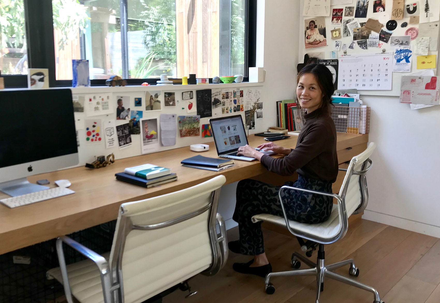
Joanne Chan
Founder, Illustoria magazine
You are the founder and former editor-in-chief of Illustoria, a tri-annual arts and literature magazine for creative kids & their grownups. Could you walk us through your professional background and explain what led you to start your own magazine in 2016?
I worked as a children’s book editor at several publishers - from indie presses to the largest publishing houses - before launching Illustoria. My first job was in sales at Heyday Books, a publisher in Berkeley with a regional focus, where I started, on the side, acquiring children’s book manuscripts and in the evenings studying to become an editor. I went on to become a children’s book editor at Tricycle Press/Ten Speed Press, and stayed there through its acquisition by Random House Books for Young Readers/Crown Publishing. After Tricycle, I was fortunate to land at Lucasfilm - where I saw so many forms of storytelling (from film, television and music to books, games, and toys) come together in one place - and stayed there through its acquisition by Disney Publishing Worldwide.
During this span of about a decade, I learned from wonderful colleagues and extremely talented and generous artists and writers - many of whom I was fortunate to fold into some part of Illustoria, whether as advisors or guest contributors (Tony DiTerlizzi, Cece Bell, Aaron Becker, Laurel Snyder). I also became a mom of two kids and experienced that tenuous balancing act of parenting, working/commuting/traveling, spending quality time with my kids, and satisfying my own creative outlet. Meanwhile, “A Picture Book Manifesto” was proclaimed and signed by contemporary children’s book heroes I highly admired, and there was a cultural movement by makers, artists, and writers toward craft and purposeful living. As a parent, the need to slow down from our fast-paced, digitally driven culture seemed a necessary and important shift to make with my kids. Illustoria was developed with those ideals in mind - to capture in a print publication for kids and adults a sense of craftsmanship, beauty, meaning, and playfulness that would encourage slowing down, making things, and discovering worlds through fresh approaches to storytelling and art.

Who is the team behind Illustoria?
In its first iteration I served as publisher and editor-in-chief; my partner, Mark, as co-founder and sounding board; and the core staff of Beth as art director and Claire as publishing assistant. I was very fortunate to lean on friends who contributed as advisors and consultants, and we had occasional part-time help in sales and marketing. To be honest, running an indie magazine required that I wear many hats—from production management to bookkeeping. Since McSweeney’s took over as publisher in the summer of 2019, under the leadership of Amanda Uhle they’ve kept on the talented core staff and have their own extraordinary in-house editors, designers, sales, operations, and fulfillment teams that contribute greatly to the publication.
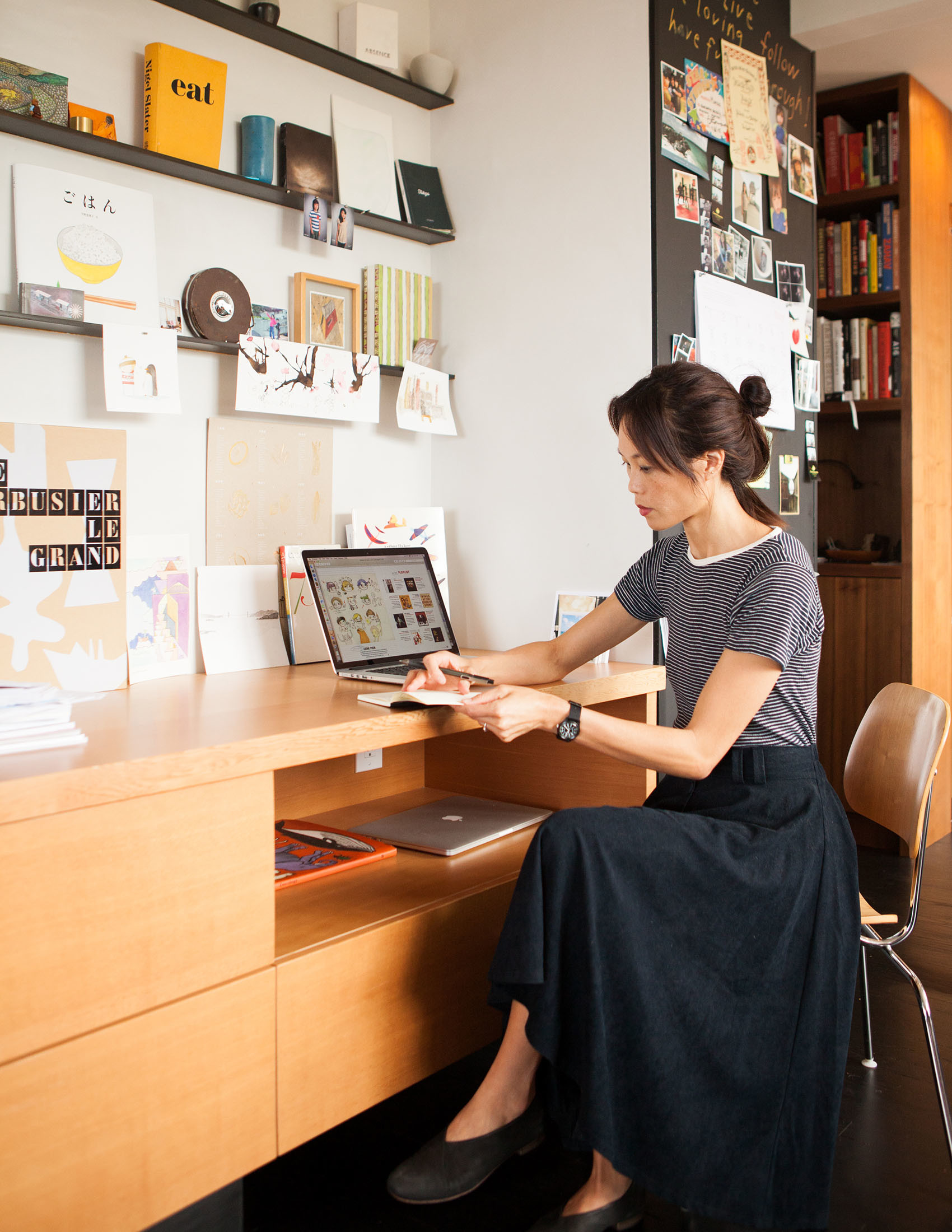

Photograpghy by Melissa Kaseman
Visually-speaking, how do you ensure the design aesthetic of the magazine appeals to children and adults alike?
From the onset balancing the appeal of the design aesthetic has been of utmost importance, as the magazine’s audience is “creative kids and their grownups.” When curating the first eight issues, I approached the visuals in a similar way to how I would approach text. With text, there is the “read-aloud” quality—do the words ring true and authentic when read aloud to a six-year-old as much as when read alone by a twelve-year-old, teenager, or adult? With art and design, is there integrity in the aesthetics so that we are treating our young audience as equals to adults? Are we making sure nothing is saccharine or “dumbed down”? My firm belief is that children are incredibly sophisticated in their visual understanding and appreciation. It’s impossible and absurd to imagine there’s a litmus test for an image, typeface, palette, or illustration to prove equally appealing to children and adults, but I think there has to be a commitment to beauty (in the sense of true-ness, not “prettiness”) and universal understanding. Those qualities I find in the best picture books, and have tried to cultivate in the magazine.
Tell us about the most imaginative response you've ever had to an artist brief?
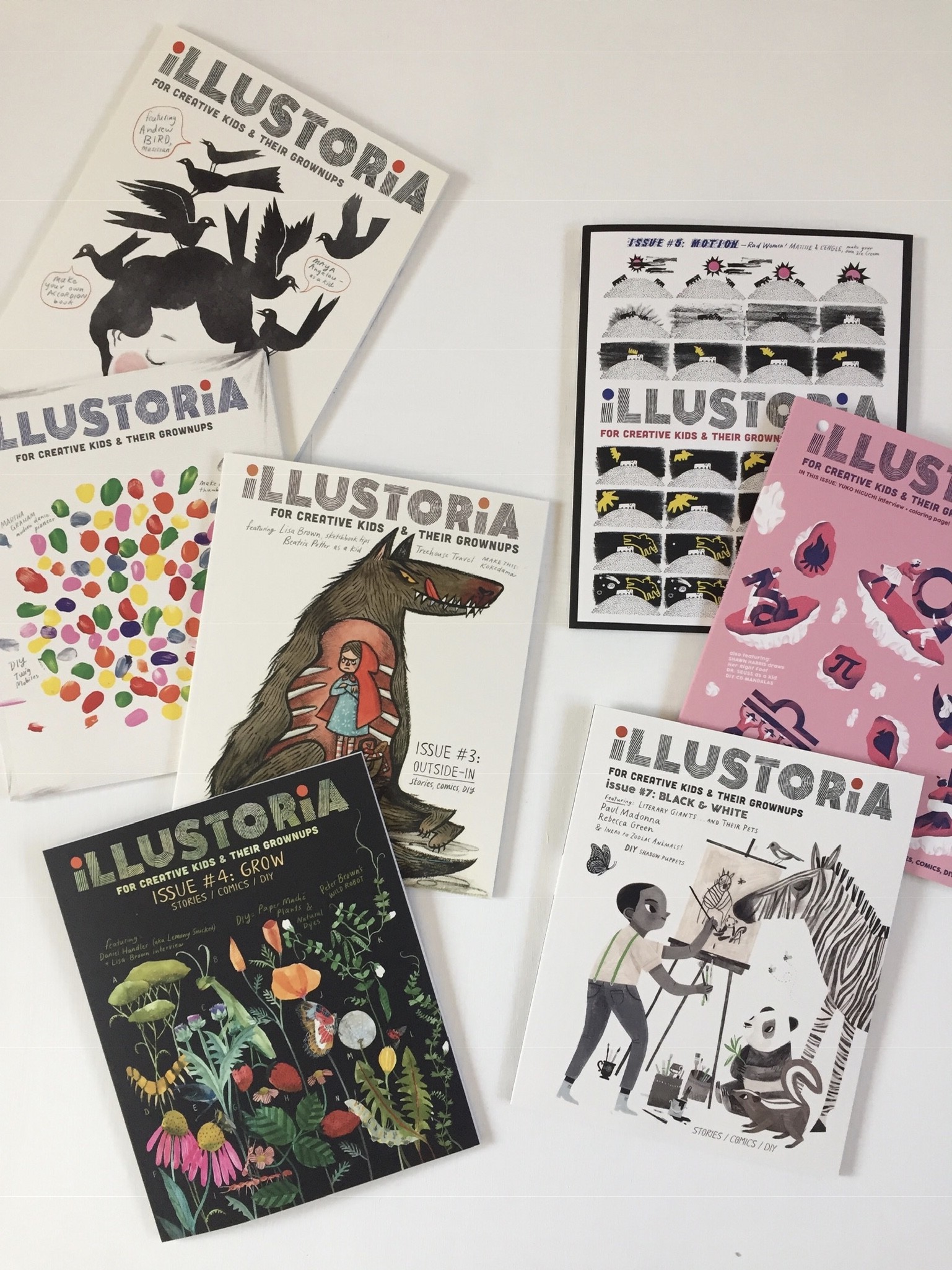
Lisa Brown’s cover art for Issue #3: Outside-In must be one of the most imaginative and outside-the-box interpretations of a given theme. I love that there are literal, symbolic, figurative, and comical elements to her execution. The well-known, folkloric figures of the smug, ravenous wolf and the put-out Little Red Riding Hood—who looks grumpily inconvenienced more than anything—gives us the sense that we all know how this story plays out, but Lisa Brown’s unexpected treatment of the tried and true brings out a whole new dimension of enjoyment and possibilities…which gets right to my fascination with the endless paths and threads in storytelling.

What do you look for in an artist's portfolio when commissioning for Illustoria?
When commissioning for the magazine, I looked for variety and diversity because each issue intentionally represents different styles and voices. It was important to me to show kids that there’s not one right way to be an artist or to be good at something; there are many forms of expression that are valid and worthy of celebration. Some common traits that spark interest include playfulness, originality, and a distinct point of view. All in all, it is such a pleasure to see artwork from artists around the world who reach out. I’m always amazed and inspired by the beautiful work that is shared with us. (Please note that the team under McSweeney’s is now acquiring for the magazine.)
Select 3 of your favourite issues to share with our audience.
This is always the hardest question for me, but if I had to choose three to highlight these would be…
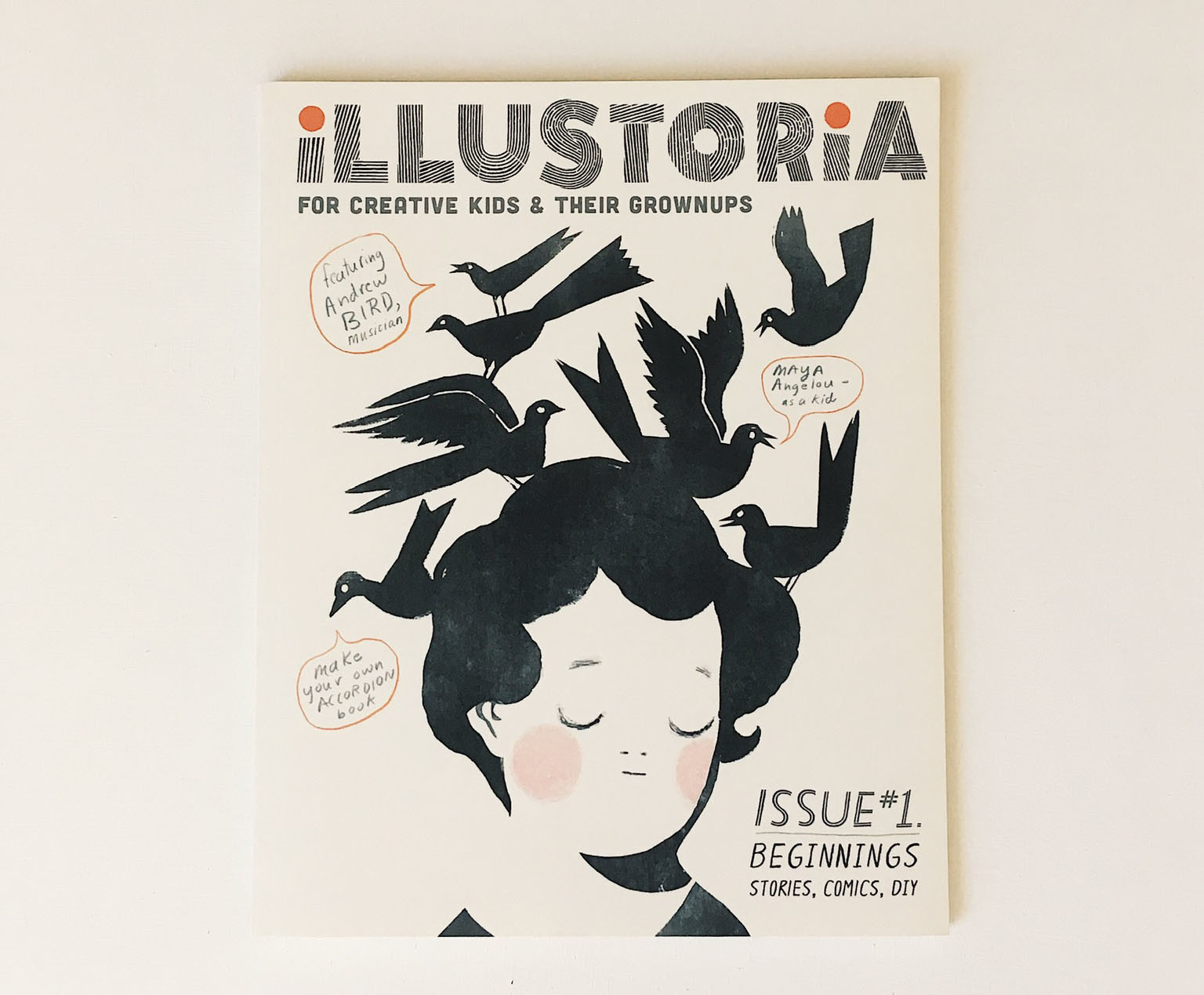
Issue 1: Beginnings, because the first always holds such a special place being an introduction, an opening of possibilities, a landing place for all the big ideas and granular, fine-tuned details of a project at its loving infancy. This issue features beloved kid-lit author Cece Bell’s illustrated depiction on the making of her incredible graphic novel, El Deafo; and master-musician Andrew Bird’s essay on learning to play the violin as a young child and the gentle, inquisitive guidance of his mother. I love the idea that by asking questions, a parent and child can learn together. This issue contains so much heart and soul, and I feel all my intentions for what Illustoria could be came together beautifully thanks to all the amazing contributors.


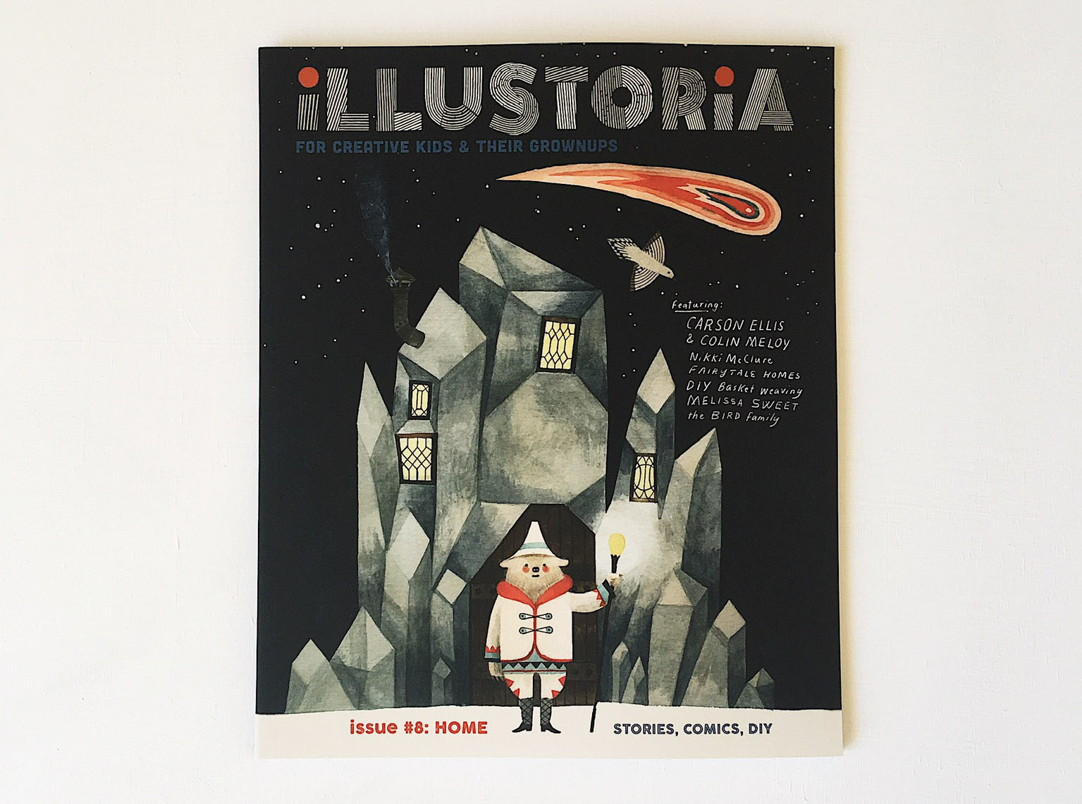
Issue 8: Home is another favorite. The theme is such a powerful one for kids and adults alike, and a timeless one that carries with it such emotional importance—perhaps now more than ever. The cover by Carson Ellis and the interview with her and Colin Meloy about balancing home life and creative work are especially charged with warmth and joy. This was also the last issue I worked on as editor-in-chief before taking time off to be more involved with my kids and my own personal projects, and I think it really speaks to how we all look for balance and meaning in our homes and also in our contributions to the larger world.

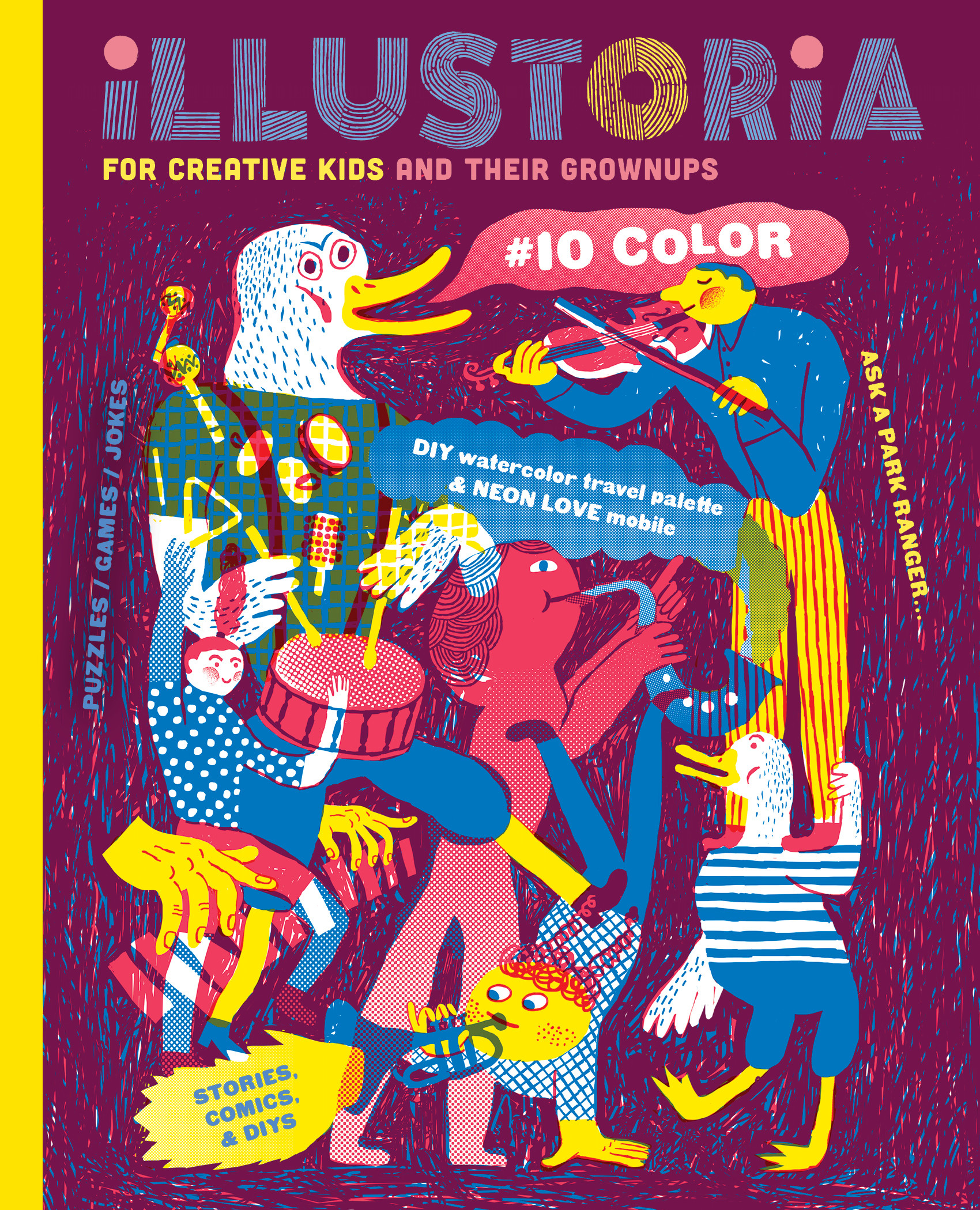
Issue 10: Color is a new favorite. This was the second issue under McSweeney’s (and, for the record, I was not directly involved in it aside from reviewing it in the broadest strokes). This issue beautifully brings together everything I love about Illustoria in a glorious celebration of color, art, and creativity while integrating the mission of The International Alliance of Youth Writing Centers by including delightful writings by young contributors and inspiring articles on youth activism. Longtime contributors Alexis Joseph and Lindsay Stripling have an extended, gorgeous piece on the history of color that is a must-read.
Which magazines from your own childhood did you enjoy reading?
As a child, I enjoyed poring over the stories and comics in Highlights and Cricket. I was also fascinated by the otherworldly photography found in National Geographic.
Who or what gets your creative juices flowing?
Great books, museums, nature walks, and, most of all, having down time to be with my children and let the conversations and meanderings go at their pace—these things all get my creative juices flowing. Art materials and a journal always being readily available, and space and time to make freely, so that one idea can be played around with and given the time to marinate and lead to the next. And of course the process of making itself always spurs more creativity.
As a mum of three children, how do you encourage creativity within the home?
My three kids vary in age—from fourteen to two-and-a-half—so their creative needs and expressions vary dramatically. A key element in my household is having materials easily accessible to dip into and just as easily to put away. We have these “art drawers” where we store materials, but I find that nothing happens until the materials are out and visible and ready to go! Aside from active engagement, I find that getting outside for walks, foraging, gardening together, listening to music, and cooking and baking—these activities encourage relaxation, connection, and a desire to experiment. It seems when we aren’t focused on “making art” or doing “creative writing,” but just exploring materials together or discussing something the kids are passionate about, that’s when the real creativity happens.
What's your vision for the future of Illustoria?
It’s humbling to admit, but I feel the future of Illustoria is here! With McSweeney’s as the magazine’s new publisher, and The International Alliance of Youth Writing Centers committed to sharing the work of young writers from around the world in its pages, Illustoria has reached a new level of commitment to and engagement with its readers. I’ll have to defer to Amanda Uhle, the magazine’s new executive publisher to answer that question, but in the meantime I am working on some new projects under Illustoria Studio which include artful collaborations in and out of the print space—so stay tuned!
