Ellen Duda
Senior Designer, Imprint (Macmillan Children's Publishing Group)
Tell us a little about your path to your current role as Senior Designer with Imprint, part of Macmillan Children's Publishing Group.
I've always gotten a buyers high from buying a new book, and 90% of the time I've bought the book because of the cover. My love for books and illustration made me very determined to get a job in publishing my senior year of college, but I took a slight detour first. I graduated from University of the Arts with a BFA in illustration and one month after graduation I hopped on a retro-fitted school bus and travelled around the country for six months. The trip was for a non-profit I co-founded that taught workshops on gardening and sustainability out of a barn-red school bus. (To this day it's one of the craziest, hippiest things I've done.) When I returned back to my home in North Carolina, I was flat broke and picked up a catering job at a local restaurant. However, my heart was still set on publishing. After several failed job applications (no one wanted to hire a girl with no experience, living in North Carolina), I got a design internship at Penguin. With only the brashness of someone with nothing to lose, I packed my bags and moved to New York. I wasn't sure if I would get a job from the internship, but I knew I needed to be in New York to get my foot in the door. Thankfully, a friend from Uarts told me about a junior designer job at Sterling Publishing and that became my first job in publishing. After Sterling, I worked at Scholastic and then a couple years later ended up at Imprint.
Imprint books are bold, creative and break the rules. Which recent titles can you share with our audience which best exemplifies this ethos?
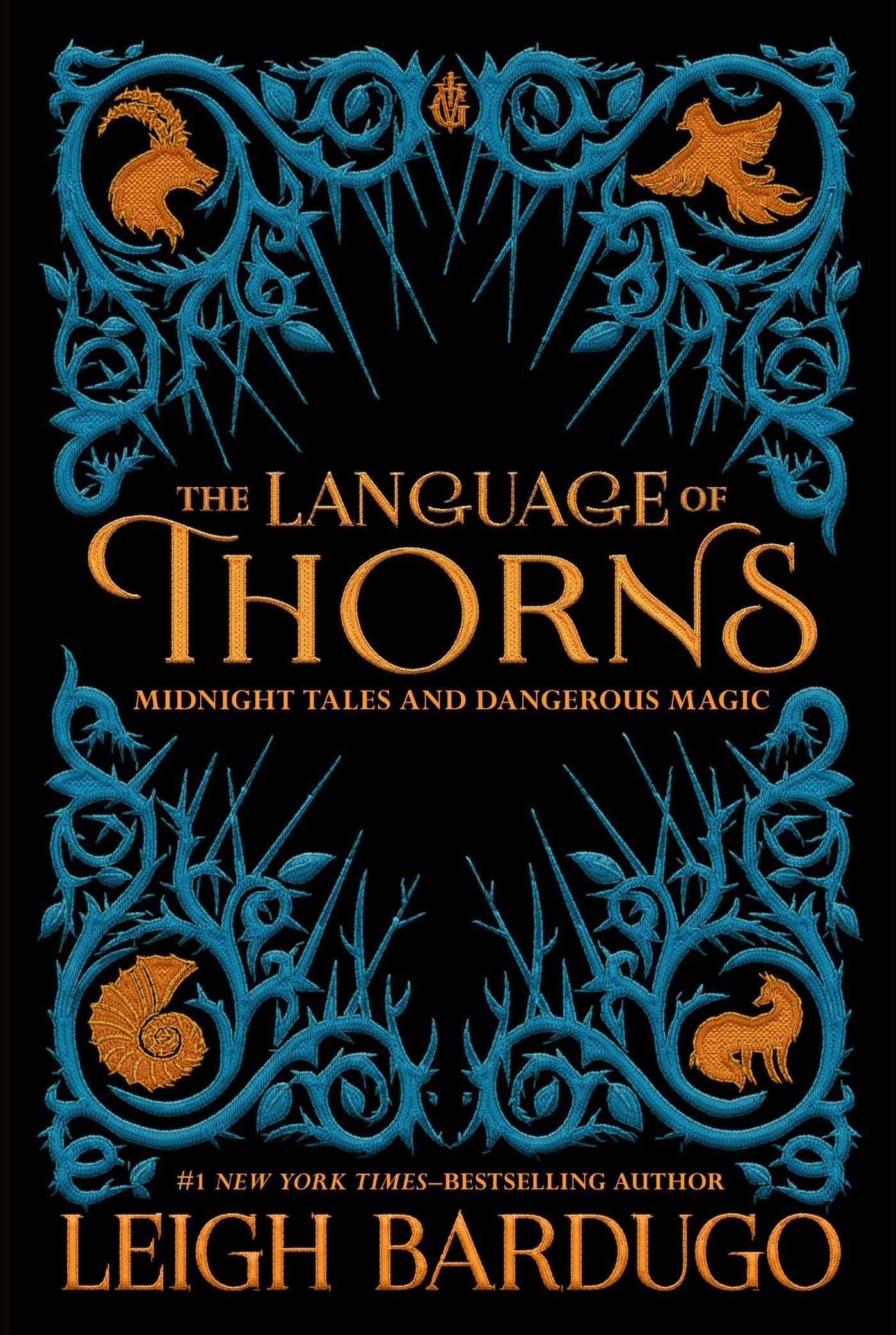
The design team at Imprint is always looking for ways to push the limits of what we can do with the packaging on our books to best match the story inside. A few recent titles we're proud of are The Language of Thorns by Leigh Bardugo, The Joy of Cookies by Cookie Monster, and The Wicker King by K. Ancrum.
With The Language of Thorns, we knew we wanted to create a lush package that matched the dark, magical stories inside. Natalie Sousa had the brilliant idea of creating an illustrated frame around the text of each story that slowly grew as you turned the page. Sara Kipin illustrated these amazing frames that revealed one new sinister piece of the story. We wanted the cover to feel like those classic antique cloth bound books, so we designed the cover as a piece of embroidery, that later was beautifully embossed to make it feel real. Overall, this book is beautiful and tactile, and feels like it's straight out of the Grishaverse.
The Joy of Cookies was an IP project we dreamed up during a weekly meeting. We had all just watched a hilarious video with Cookie Monster and started brainstorming fun book ideas. The Imprint team LOVES puns, so after "The Joy of Cookies" was shouted out as a title idea, the whole project just snowballed from there. The design team really tried to channel what we thought a book would look like if Cookie Monster had made it himself. My favorite part about the book is the die-cut bite mark that cuts through the whole book. Cookie Monster gets so excited, we imagined him taking a bite out of his own book in all his enthusiasm.
The Wicker King was a debut book for K. Ancrum and when I read the manuscript I completely fell in love with her writing. It's a moody story about a teen boy who tries to save his best friend from this hallucinatory world he's spiraling into. The first draft was written with artifacts between specific chapters that told missing pieces of the story. As a designer, I loved the idea of artifacts telling a piece of the story, so with the interior design I went crazy making these pieces feel as authentic as possible. In the final book there are many handwritten notes, photographs, journal entries and drawings that integrate into the story. The pages slowly become water damaged and darker, finally fading into black pages with white type when the characters hit rock bottom. One unplanned design outcome was that the page design created an ombre effect on the edge of the book and readers loved it.


Who or what inspires you on a daily basis?
The illustrator in me is always looking for new artists that have clever concepts or use of images (The New Yorker cover always has some of the most clever illustrations). Like most people, I spend way too much time on Instagram (@childrensillustrators) finding my way down the rabbit hole to new artists. However, when I'm not getting lost in the social media web, I find a lot of inspiration just interacting with the city on a daily basis.
The Imprint design team tries to take monthly design outings to art exhibits, book stores or anything funky in the city. Our outings started as a way to get inspiration for book designs, but has turned into a fun way to seek out new content and think outside the box. I love going to unexpected places or exhibits, because you never know what's going to spark an idea.
Can you walk us through your cover creation process.
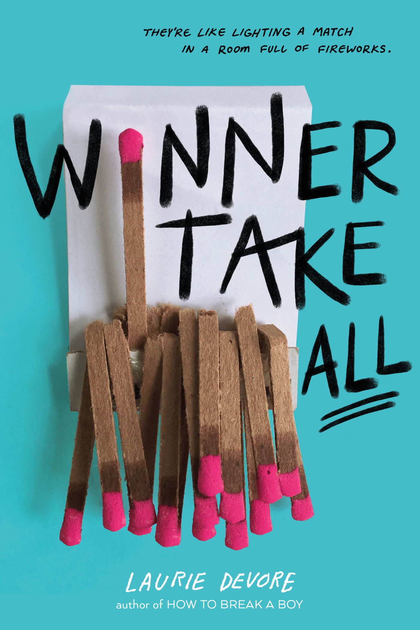
The cover creation process varies from book to book. My favorite process is to read a manuscript and then hone in on the essence of the book. I often will ask myself a few questions: What is a strong message or theme that is being conveyed in the book? How can I represent that with imagery that doesn't feel too literal? One good example of this process is the book Winner Take All by Laurie Devore. This is a young adult novel about a driven, type-a girl who cares so much about being the best in school and sports, that she ruins all her relationships. When coming up with concepts for this cover I thought about being an over achiever to the point of destruction. Some images that came to mind were matches (burning everything down), gold stars (acknowledgment for high achievements) and burnt prize ribbons (ruined awards). In the end we went with a matchbook that looked subtly like a middle finger as a way to show her attitude towards the world. I love how edgy and fun this cover is, because it truly reflects the attitude of the main character.
Which titles remain Imprint's biggest hits so far?
The Language of Thorns and The Joy of Cookies are two of Imprint's best selling books so far. Both books are beautiful and fun to read in their own way, which is why I think readers were so drawn to them.
Are there particular illustration styles or subject matters that are hot on your radar right now?
I'm very interested in #OwnVoices stories right now. I find it's very important to work with artists who can relate to the stories they are illustrating and also bring some of their own experience to the narrative. The feminist in me is also loving all of these badass female illustrators making work that celebrates women and all their strengths.
What's the best piece of advice anyone has ever given you?
No one wants to work with a jerk. Making friends and being kind to those you work with has been one of the most powerful pieces of advice in my career. All of the opportunities I've had, have either happened because a friend has recommended me or they've introduced me to someone new. Being kind to others makes them remember you and want to work with you again. Plus, it's always fun to make new friends.
Tell us about your most memorable project to date.
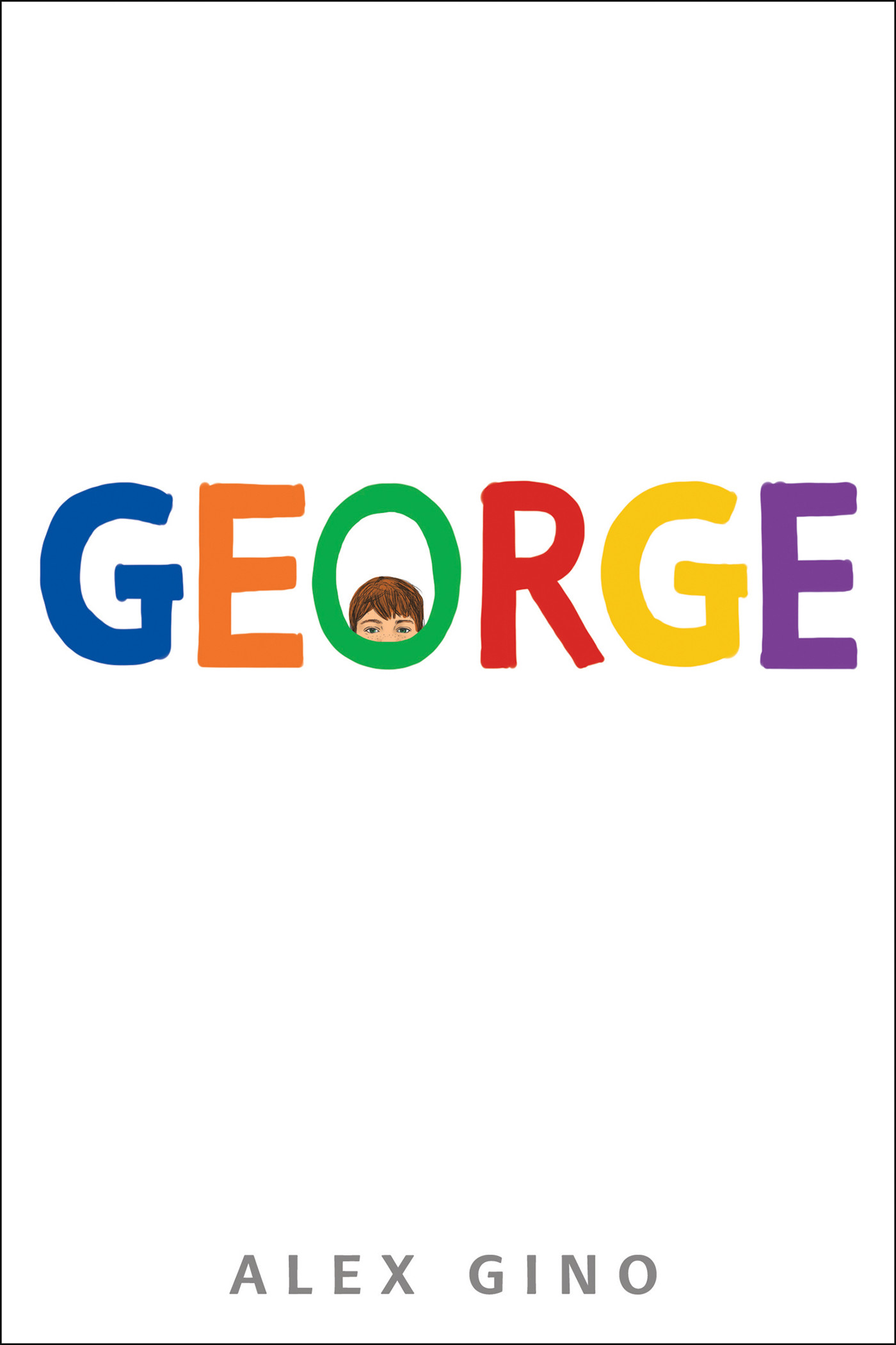
One of my favorite projects to work on while I was still at Scholastic, was George by Alex Gino. This was one of the first middle grade novels about a trans character written by a genderqueer author and was such an important book when it came out. I fell in love with the story and the main character Melissa. It was an honor to be able to design and illustrate the cover.
Which famous (and lesser known) children's books did you grow up with?
Oh man, this is a hard one! A lot of my favorite books as a kid were mainly because of the art and humor. I was a huge fan of William Joyce's Bob the Dinosaur and A Day with Wilbur Robinson. I also loved the Lane Smith & Jon Scieszka books The Stinky Cheese Man, Math Curse, and The True Story of the 3 Little Pigs!. Another favorite, mainly for the artwork, was The Velveteen Rabbit illustrated by Donna Green. As I got older I fell in love with the Harry Potter series and like most kids I would doodle scenes from the book and create my own versions of the cover.
What would your dream project look like?
I would LOVE to work on a book that is a compilation of fully illustrated advice for middle grade readers. Being in middle school can be such a hard time as a kid and I think it helps to hear encouragements from those who survived that awkward time. In a dream world, I would hire multiple illustrators to draw and write out each piece of advice, so the final book would be beautiful and helpful!